Exploring geospatial relationships
arcgispro
geospatial
map
esri
We have been hired by a state health coalition that is focusing its efforts on raising awareness about and lowering obesity rates in the state of Illinois. Obesity prevalence has risen dramatically throughout the state over the past decade, along with the incidence of type 2 diabetes, but the prevalence of obesity is higher in some areas than others.
We will explore obesity prevalence rates by county, create visual aids for displaying a year-over-year rising trend, and begin to explore possible reasons why some counties may have higher prevalence rates than others. For instance, is there a link between average income level and obesity levels? What about comparing obesity rates to data that shows limited access to grocery stores—are these “food deserts,” with lesser accessibility to healthy foods, more likely to have higher obesity rates?
Your job is to combine obesity statistics provided by the Centers for Disease Control and Prevention (CDC) with county GIS data to do an initial visual analysis of the data, which will eventually lead to more rigorous analysis techniques. The end objective of the analysis is to create informative products that will educate and guide advocates and policymakers.
Comparing some variables
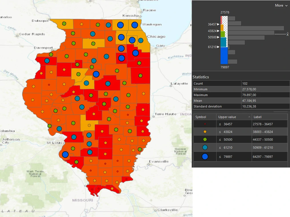
Some studies suggest that people with lower income have higher incidence of obesity and diabetes. You want to see if there is an obvious correlation between median income and obesity rates in Illinois counties. Although you cannot draw scientific conclusions from a visual observation, you can determine whether further analysis is warranted.
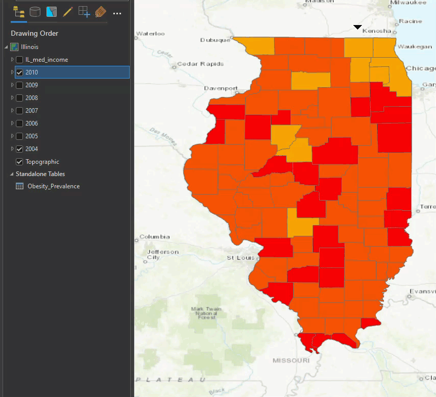
Notice that the new class breaks change your map dramatically: most counties are now in the second-lowest category (23.1% to 27%), because no more than 27 percent of their populations are considered obese. The highest category (31.1% to 35%) is reserved for counties with more than 31 percent of their population considered obese. The higher thresholds are required to accommodate the higher percentages of subsequent years.
Comparing yearly data
We can comparing yearly of our data. Lets say that we want to compare 2004 to 2010. The visual impact of the data is striking. With a few exceptions, almost every county’s obesity prevalence goes up for each year.
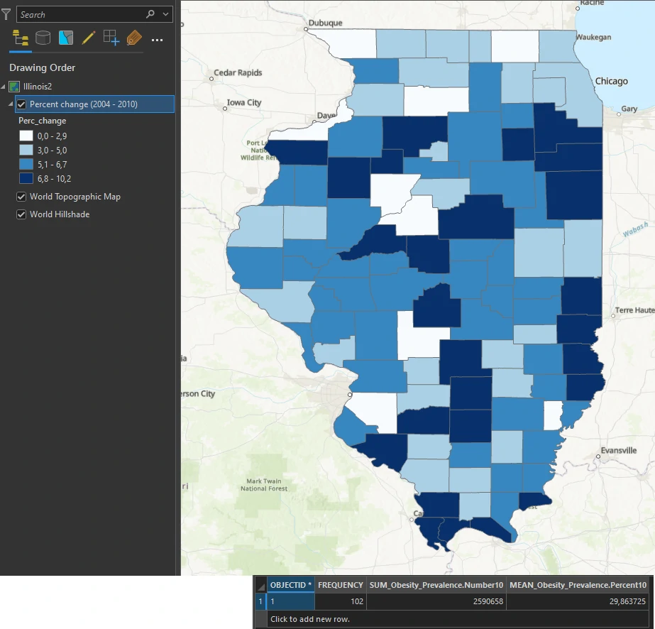
Generate Statistic calculation
We can calculate difference percentage value and generate a layer. The Percent change layer shows which counties had the greatest increases between 2004 and 2010. These darker counties might be of interest to researchers and policymakers. The reason for the sudden changes should be investigated.
Connect spatial datasets
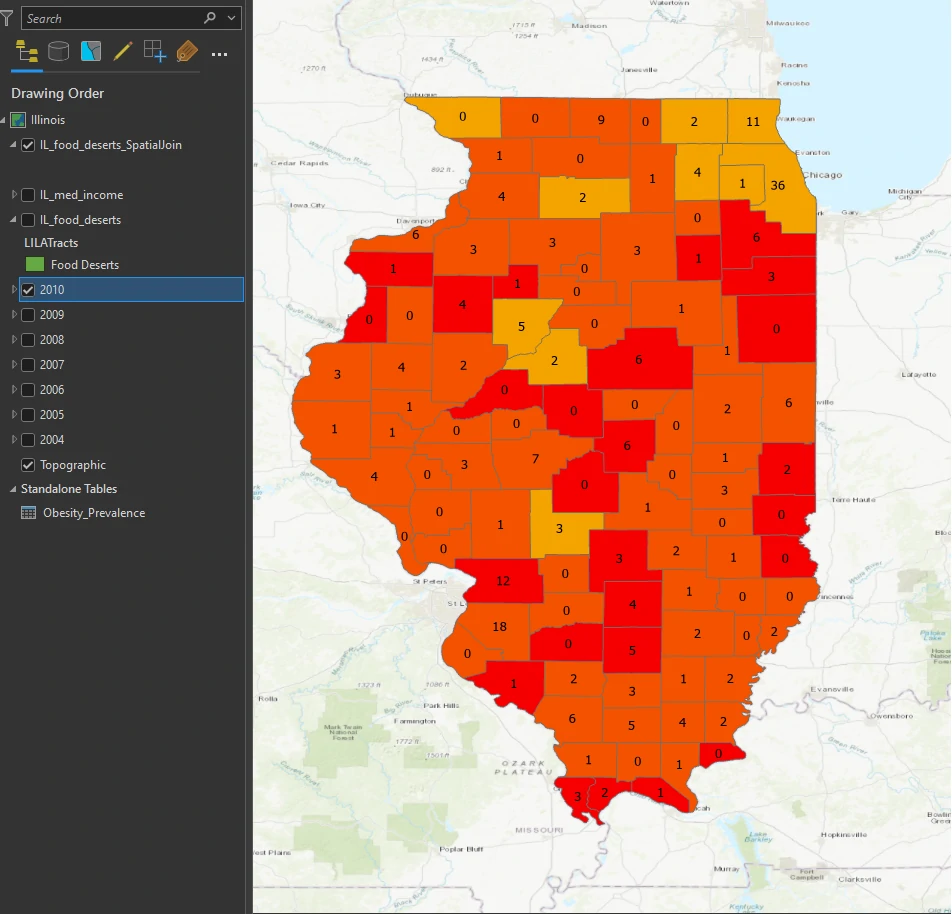
We will test one more hypothesis: that obesity rates correlate with higher numbers of food deserts, or low-income areas with limited access to full-service grocery stores.
This map will show that relation between population in yearly data and IL_food_deserts. This layer shows Illinois data for the census tract level rather than the county level.
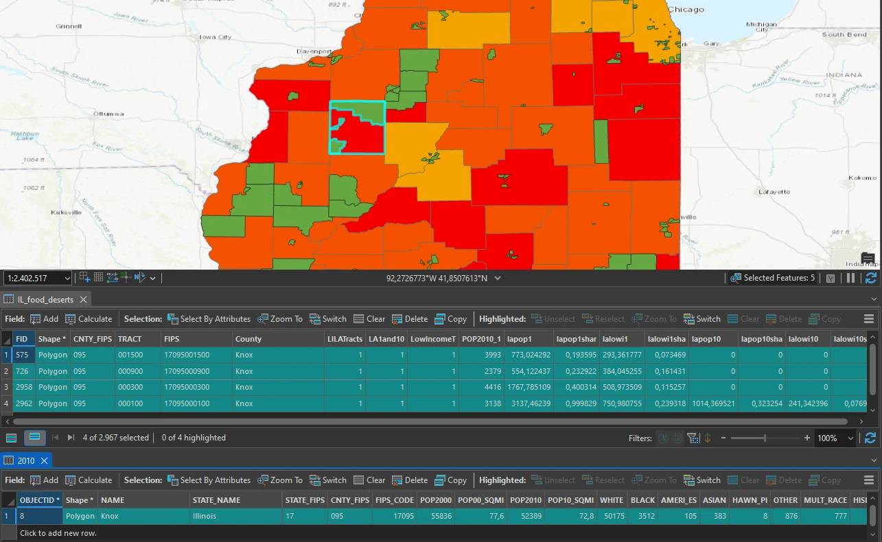
Although some counties have both high obesity prevalence and a high number of food desert tracts, there does not seem to be an obvious correlation at first glance. Some red counties have zero or only one food desert tract, while others have several.
Although you hoped to see some obvious correlative patterns between obesity, income, and food deserts in your initial visual analysis, the comparison of thematic maps is not the end of the story.