Basic Presenting Map Project
arcgispro
geospatial
map
esri
Maps convey our ideas about locations to the minds of map readers. It is a fine balance of communicating the appropriate amount of information by displaying data and graphic elements through a suitable medium, such as a paper map or mobile device.
Creating a map layout requires answering some key questions:
- What is the purpose and intended use of the map?
- Who is the target audience, and what is their familiarity with the area of interest? What kinds of labels will provide a sense of familiarity?
- What is the most appropriate map scale to convey the map information? How detailed or general will the map data be displayed?
- What type of map is it—quantitative or qualitative? What kind of symbology will most effectively communicate the data?
- What are the dimensions of the map (printed or digital)? What display orientation will best fit, and how will the map elements be organized?
A good map not only provides facts but also persuades opinion. We will want to think about the context of the data and frame the results to match the geographic area of the phenomena. Also think about graphic hierarchy and how map features are overlaid on top of each other. A well-composed layout promotes a visual hierarchy that map users can explore naturally.
Study case scenario
In this project we are The agency that work for aggregates much of the broadband accessibility data for the state of Utah. As part of the agency’s ongoing activities, it will determine broadband internet availability and work with stakeholders and service providers to identify accessibility, support broadband planning and policy, and study broadband trends.
Much of the broadband internet availability data has been collected through broadband service provider submissions and publicly available sources. As part of a large mapping project, several areas must be mapped. We will use our knowledge of cartographic principles and GIS skills to complete maps that show the maximum advertised broadband speeds for a county in Utah. In addition, we will prepare some data before symbolizing and labeling it.
The Dataset
The data come from TK Telekom that provides internet services, telephone services, data transmission, and line lease for telecommunications operators, public administrators, and business customers. We Focus on Utah state, mainly on Wireline and Wireless Broadband, and Community Anchor Institutes dataset.
- Wireline_Broadband — a polygon feature class of wired internet coverage (Source: Utah Broadband Project; Utah Automated Geographic Reference Center; Governor’s Oce of Economic Development)
- Wireless_Broadband — a polygon feature class of wireless internet coverage (Source: Utah Broadband Project; Utah Automated Geographic Reference Center; Governor’s Oce of Economic Development)
- Counties — Utah county boundaries (Utah AGRC, BLM)
- Community_Anchor_Institutes — a point feature class of the community sites (Source: Utah Broadband Project; Utah Automated Geographic Reference Center; Governor’s Oce of Economic Development)
Apply detailed symbology
In this part, we will apply detailed symbology to the data to visualize maximum advertised broadband speeds—both wired and wireless broadband.
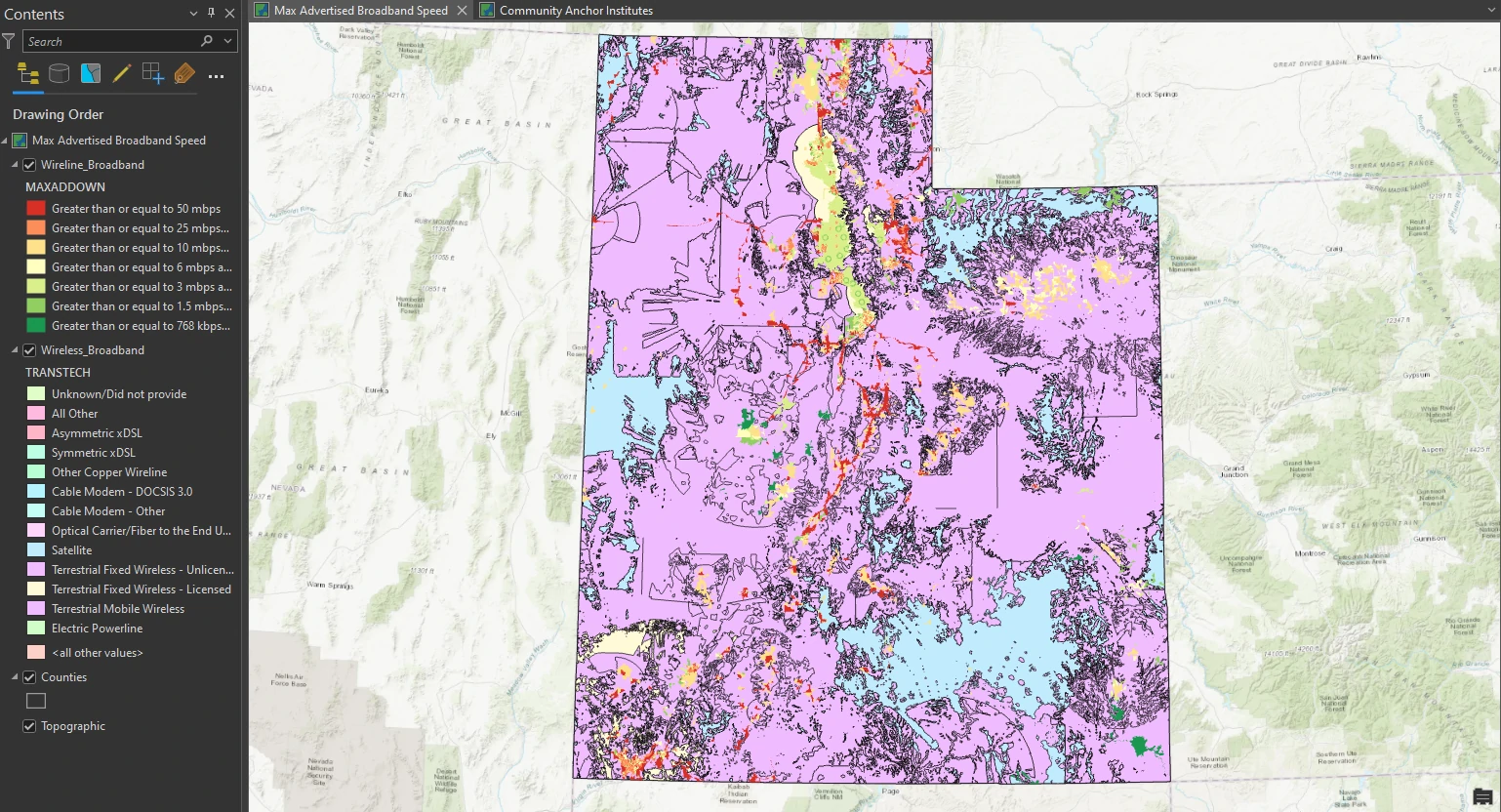
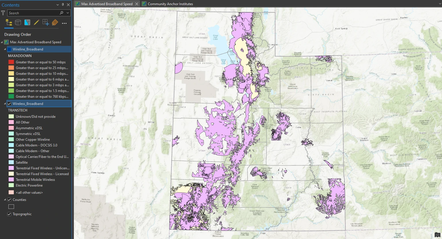
To do that, we need the Wireline_Broadband layer represents all census tracts that have wired broadband technologies, and the Wireless_Broadband layer represents areas that have wireless technologies. represents areas that have wireless technologies. we are required to show only fixed wireless technology and visualize it. To show only fixed wireless, we will create a definition query to select a subset of all the wireless technologies.
Apply a definition query
To make it easier to analyze, we filter our data only for wireless broadband technology with values Terrestrial Fixed Wireless technologies Unlicensed and Licensed . This value needed to isolates only fixed wireless technology areas.
Fine-tune the categories
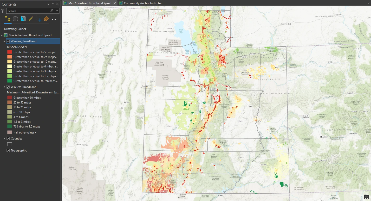
Next, we will apply more detailed symbology to the wireless broadband layer to show the maximum advertised download speed available. we will symbolize only broadband download speeds that are faster than 768 kilobits per second (Kbps).
This process can be done by aggragate and lebeling Maximum_Advertised_Downstream_Speed column to get this categories:
- Greater than 50 mbps
- 25 to 50 mbps
- 10 to 25 mbps
- 6 to 10 mbps
- 3 to 6 mbps
- 1.5 to 3 mbps
- 768 kbps to 1.5 mbps
Apply symbol layer drawing
Next, we will look at the symbology on the map and compare it with the order of the color ramp in the Contents pane. It may be difficult to see how overlapping features are being represented, but when we inspect it closely, the higher speeds are drawn in a lower order. we will use symbol layer drawing to control the drawing order of feature symbology—essentially overriding the default drawing sequence.
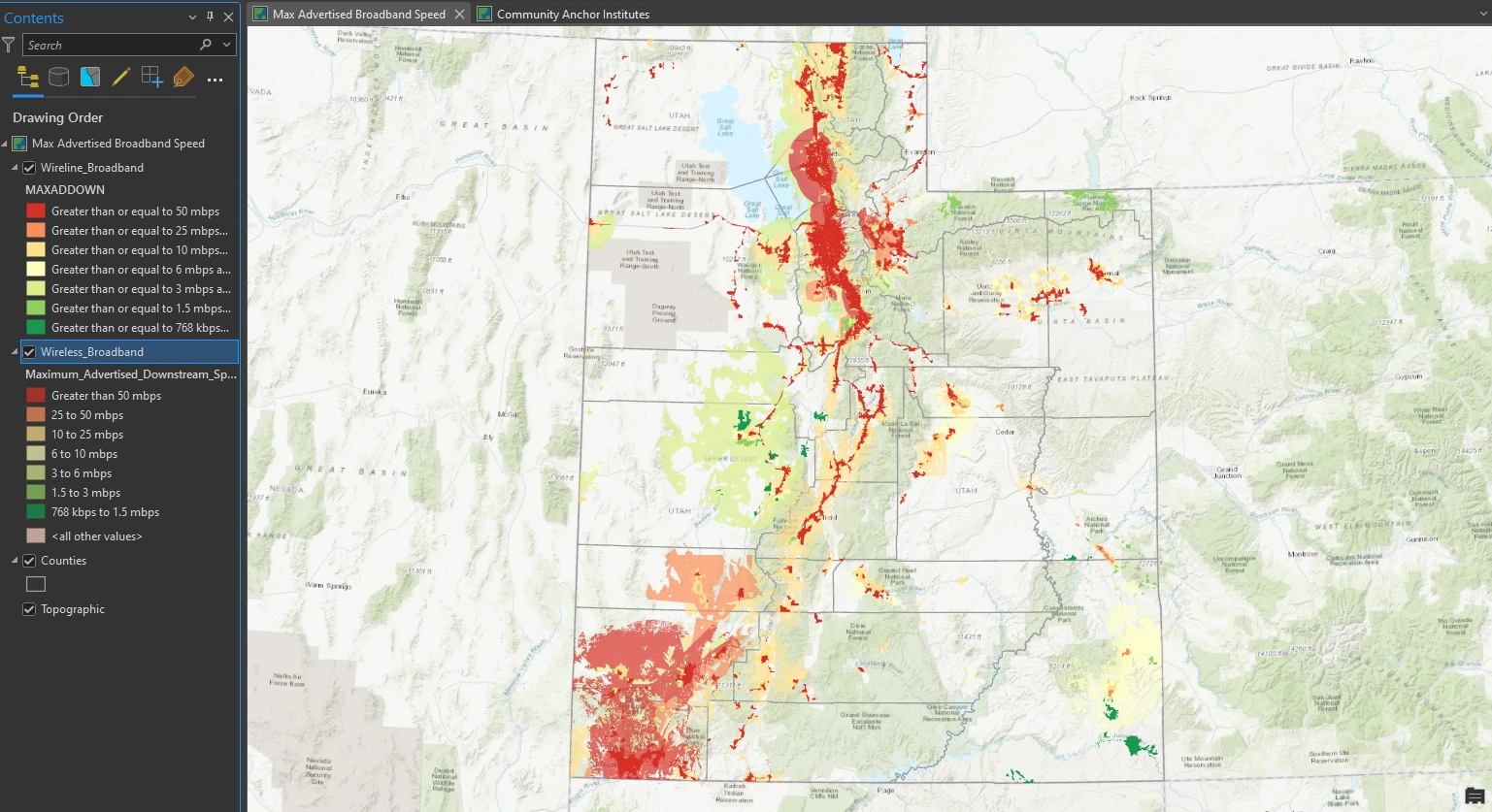
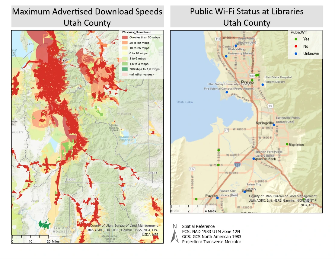
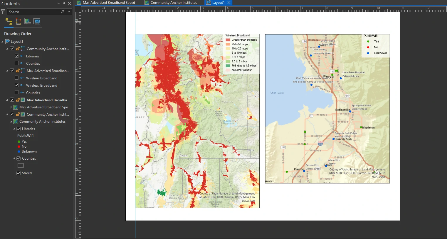
This map now shows coverage by fixed broadband technologies (DSL, cable, fiber, and fixed wireless) based on maximum advertised download speeds marketed to all consumer levels, including commercial businesses.
Label features
Label at point or area
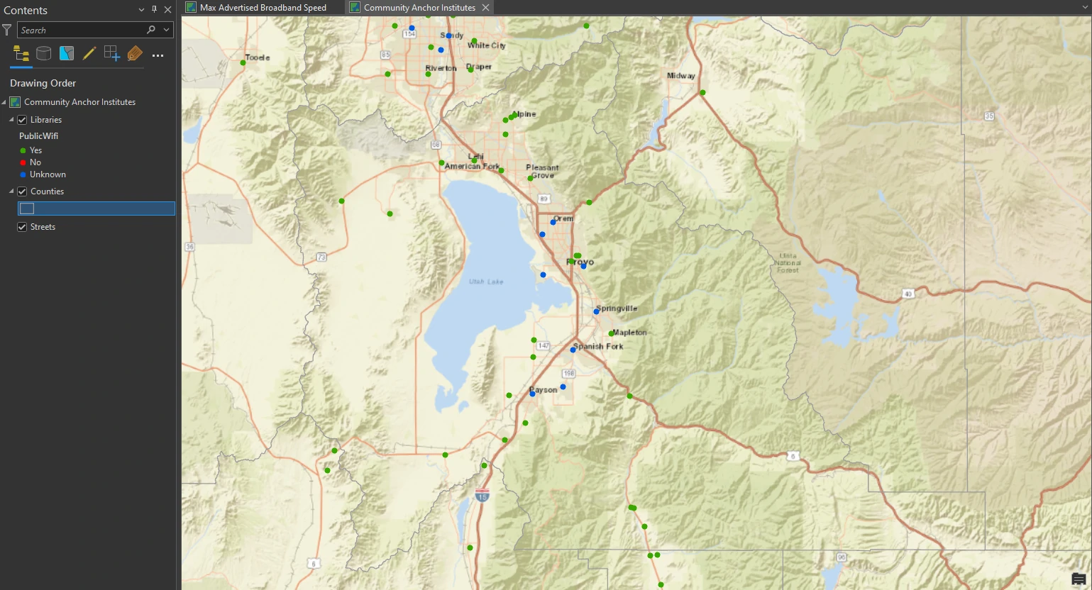
In this part, we will focus on Community_Anchor_Institutes dataset. Our mapping project also requires features to be labeled on the Community Anchor Institutes map. Labels are based on one or more feature attributes and placed near or on a feature. We utilize dynamic labeling — Label positions that can change depending on map scale, addition or removal of features, or the attribute used.
By default, ArcGIS Pro uses Maplex Label Engine. By this engine, we have access to a new set of label placement properties that allow us to control how labels are oriented, formatted, and placed in feature-dense areas and how conflicts between labels can be resolved. In addition to the standard feature types, Maplex Label Engine provides label placement options for features such as streets, contours, rivers, boundaries, and land parcels.
To get more readable map, we filtered only to show PublicWifi = Unknown. Additionally, we can use a label expression to change the labels from all uppercase letters to title case.
Next, we apply there settings to get The labels to look more legible on the map:
- font = Calibri
- font style = Bold
- the size = 8 pt
- the color = Gray 60%
- Halo Symbol = White Fill 50% Transparency
- Placement = Best Position
- Measure Offset From to = Exact Symbol Outline
- Stack - Change Maximum Number of Lines = 2
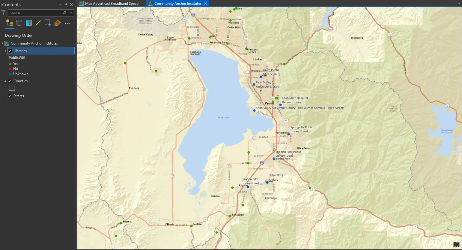
By apply these settings, The labels now look properly placed without overcrowding. We can make the lables appear at only specific map scales, you can specify a label visibility range. In minimum scale value, we can type 1:450.000. It mean that when the map is zoomed out beyond 1:450,000, the labels are not displayed.
Label at boundary
We will create another label class to label more features, this time for Utah counties. This label class will provide more visual information to your map users.
By select Countries layer we can apply these settings:
- font = Century
- font size = 7 pt
- color = Raw Umber
- Placement = Boundary Placement
The county labels are switched from the default regular placement to boundary placement, which means that they follow the boundary lines close. This type of labeling allows readers to easily locate boundaries on a map.
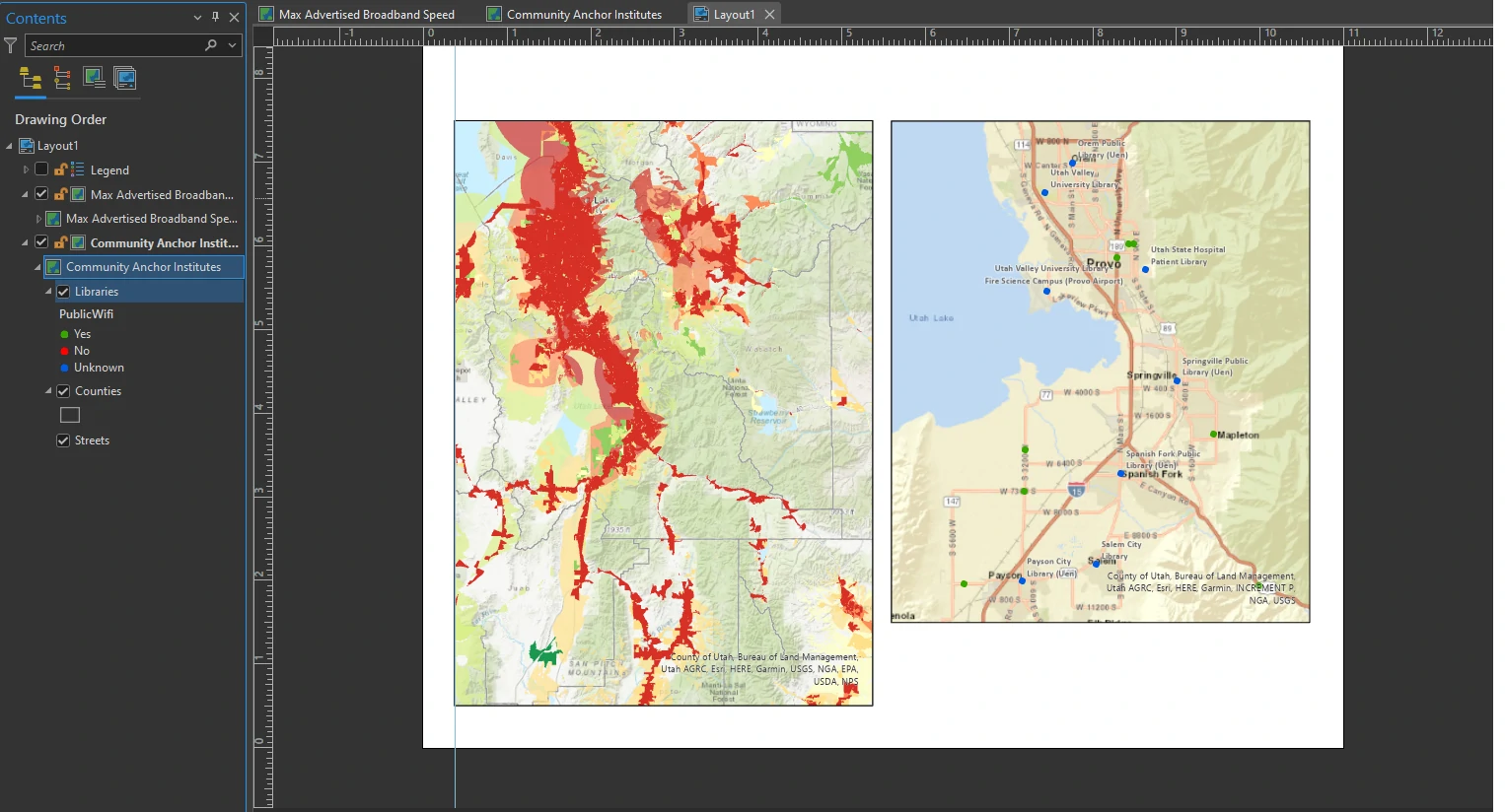
Create a page layout
default page layout
A page layout includes map frames and other map elements, such as a scale, legend, north arrow, and more. Deciding the dimensions and orientation of a layout early on facilitates the design process. It influences your decisions on factors such as map frame sizes, map scale, text size, and how other map elements may fit.
In this part we utilize map frames. Map frames are containers for maps in your page layout. They can contain any map in your project, including 3D scenes.
We apply these settings on our page layout:
- A landscape layout
- page size = Letter 8.5” x 11”
- Map Frame = Default Extent - from the Community Anchors Institutes gallery
- width = 5 in
- height = 6 in
- upper-right anchor
- X location = 10.6 in
- Y location = 7.5 in
- (optional) Vertical Guideline with position = 0.375 in
- Map Frame = Default Extent - from the Max Advertised Broadband Speed map
- width = 5 in
- height = 7 in
- top-right anchor
- snap the map to the Vertical Guideline
Insert a legend element
A legend will help your map readers understand the meaning of the broadband speed symbols on the map as well as the status of public Wi-Fi availability at libraries in Utah County. A basic legend consists of a patch (symbol) and a label (explanatory text).
We apply these settings on our page layout:
- Patch Width = 16 pt
- Patch Height = 10 pt
- clear the Layer Name and Headings check boxes
- Font Name = Arial
- Size = 9 pt
- For Border, change the symbol to 0 pt
- For Background, click the Fill down arrow, and click Arctic White.
- Change the Transparency to 30%
- To adjust the gap to improve the spacing around the patches and labels, increase the Background X and Y gaps to 0.1 inches.
Insert a scale bar
A scale bar is a dynamic element that provides an indication of the size of features and distances on the map.
We apply these settings on our page layout:
- scale type = Scale Line 3
- font size = 8 pt
- Divisions = 1
- Units group = Miles
- white background with 30% transparency
- Resize the scale bar so that it displays to 20 miles
To create scale bar for another map we can copy-paste in the Contents pane. Move the duplicated scale bar to the other map frame. Do not forget to change scale bar source into new map. On the Design tab on the ribbon, in the Map Frame group, choose Community Anchor Institutes Map frame from the list. The scale bar changes to match the map scale of this map frame.
Insert a north arrow
A north arrow is a dynamic element that indicates the orientation of the map.
We apply these settings on our page layout:
- Fill color = Gray 60%
Insert dynamic text, a title, and rectangles
We will finish the layout with some descriptive text elements and decorative shapes. In this part we will add a Spatial Reference, add a rectangle to place the dynamic text element.
We apply these settings on our page layout:
- Convert to Graphics
- keep only the PCS, GCS, and Projection tags and delete the others
- Place next to the north arrow
- font = Calibri
- font size = 18 pt
- Horizontal Alignment = Center
For a rectangle we apply these settings on our page layout:
- Color = 20% Gray
- the Outline Color = No Color
- order = send backward
- snap both text elements and both gray rectangles to appropriate borders (the width of each map frame).
The Result
Save a layout template
A layout file includes the page, layout elements, and any maps referenced by map frames on the page. You can use a layout file to create templates or share existing layouts with others. However, data is not included in the layout file—only links to the data.
Package and share a project template
Although page layout files are useful, they do not include data. To truly share aspects of your Utah broadband map project, you can create a project template, which can be shared directly in ArcGIS Pro and uploaded to your ArcGIS Online.