Point Pattern Analysis
geospatial
map
Pattern
Introduction
Points are spatial entities that can be understood in two fundamentally different ways:
- On the one hand, points can be seen as fixed objects in space, which is to say their location is taken as given (exogenous). In this interpretation, the location of an observed point is considered as secondary to the value observed at the point.
- On the other hand, an observation occurring at a point can also be thought of as a site of measurement from an underlying geographically-continuous process. In this case, the measurement could theoretically take place anywhere, but was only carried out or conducted in certain locations.
This kind of approach means that both the location and the measurement matter.
When points are seen as events that could take place in several locations but only happen in a few of them, a collection of such events is called a point pattern. In this case, the location of points is one of the key aspects of interest for analysis. A good example of a point pattern is geo-tagged photographs: they could technically happen in many locations, but we usually find photos tend to concentrate only in a handful of them.
Theory
Point pattern analysis is thus concerned with the visualization, description, statistical characterization, and modeling of point patterns, trying to understand the generating process that gives rise and explains the observed data.
Common questions in this domain include:
- What does the pattern look like?
- What is the nature of the distribution of points?
- Is there any structure in the way locations are arranged over space? That is, are events clustered? or are they dispersed?
- Why do events occur in those places and not in others?
To make it align with definition we can discuss about what is the Pattern.Pattern, relates to the result of that process. In some cases, it is the only trace of the process we can observe and thus the only input we have to work with in order to reconstruct it. Although directly observable and, arguably, easier to tackle, pattern is only a reflection of process. The real challenge is not to characterize the former but to use it to work out the latter.
Dataset
Load dataset
we will use geo-tagged Flickr photos from Tokyo. We will treat the phenomena represented in the data as events: photos could be taken of any place in Tokyo, but only certain locations are captured. **why this matter?** The rise of new forms of data such as geo-tagged photos uploaded to online services is creating new ways for researchers to study and understand cities. Where do people take pictures? When are those pictures taken? Why do certain places attract many more photographers than others? In this project we will explore metadata from a sample of geo-referenced images uploaded to [Flickr](https://www.flickr.com/) and extracted thanks to the [100m Flickr](https://webscope.sandbox.yahoo.com/catalog.php?datatype=i&did=67) dataset.
db = pd.read_csv(r"..\map\tokyo_clean.csv")
db = gpd.GeoDataFrame(db, crs="EPSG:4326",geometry=gpd.points_from_xy(db.longitude, db.latitude))
| user_id | longitude | latitude | date_taken | photo/video_page_url | x | y | geometry | |
|---|---|---|---|---|---|---|---|---|
| 0 | 10727420@N00 | 139.7 | 35.674 | 2010-04-09 17:26:25.0 | http://www.flickr.com/photos/10727420@N00/4545144774/ | 1.55514e+07 | 4.25586e+06 | POINT (139.700499 35.674) |
| 1 | 8819274@N04 | 139.767 | 35.7091 | 2007-02-10 16:08:40.0 | http://www.flickr.com/photos/8819274@N04/2650331694/ | 1.55587e+07 | 4.26067e+06 | POINT (139.76652099999998 35.709095) |
| 2 | 62068690@N00 | 139.766 | 35.6945 | 2008-12-21 15:45:31.0 | http://www.flickr.com/photos/62068690@N00/3125862684/ | 1.55586e+07 | 4.25866e+06 | POINT (139.765632 35.694482) |
| 3 | 49503094041@N01 | 139.784 | 35.5486 | 2011-11-11 05:48:54.0 | http://www.flickr.com/photos/49503094041@N01/6332937940/ | 1.55607e+07 | 4.23868e+06 | POINT (139.784391 35.548589) |
| 4 | 40443199@N00 | 139.769 | 35.6715 | 2006-04-06 16:42:49.0 | http://www.flickr.com/photos/40443199@N00/2482548783/ | 1.5559e+07 | 4.25552e+06 | POINT (139.768753 35.671521000000006) |
The Code
By calling maps.central_tendency, we can get some main parameters to analize Point Pattern such as mean_center, median_center, std , ellipse_value. we can explore and deep dive to analize Point Pattern by visualiation. we can call maps.map_points to generate three plots get more insight.
mean_center,med_center,std,ellipse_value = maps.point_pattern(main_data,
                                            col_list=['longitude','latitude'],
                                            types='points')
This function requires the following parameters:
- main_data (
geodataframe): Data location and value - types (
string): type of data. namly[point, poly] - col_list (
list): list of columns name to get coordinat in main data
maps.map_points(main_data, col_list=["longitude","latitude"])
This function requires the following parameters:
- main_data (
geodataframe): Data location and value - col_list (
list): list of columns name to get coordinat in main data
The result
Result The Table
| params | values | |
|---|---|---|
| 0 | mean_center | [139.73730289 35.67181347] |
| 1 | median_center | [139.7438701 35.67423052] |
| 2 | std | 0.07276603382028334 |
| 3 | ellipse_value | [0.0589476986565102, 0.081723578779534, 1.3936583780349217] |
| 4 | convex_hull_vertices | [[139.563369 35.726562],[139.562972 35.612766],[139.564458 35.544522]] |
| 5 | min_rect_vertices | (139.562972, 35.523416, 139.915277, 35.8175) |
| 6 | min_rect_width | 0.3523050000000012 |
| 7 | min_rect_height | 0.2940840000000051 |
| 8 | min_circle_vertices | [139.73569439629452, 35.67616247358409, 0.2181168832761187] |
Visualizing point patterns
There are many ways to visualize geographic point patterns, and the choice of method depends on the intended message.
by this visualization we can get some insights, such as:
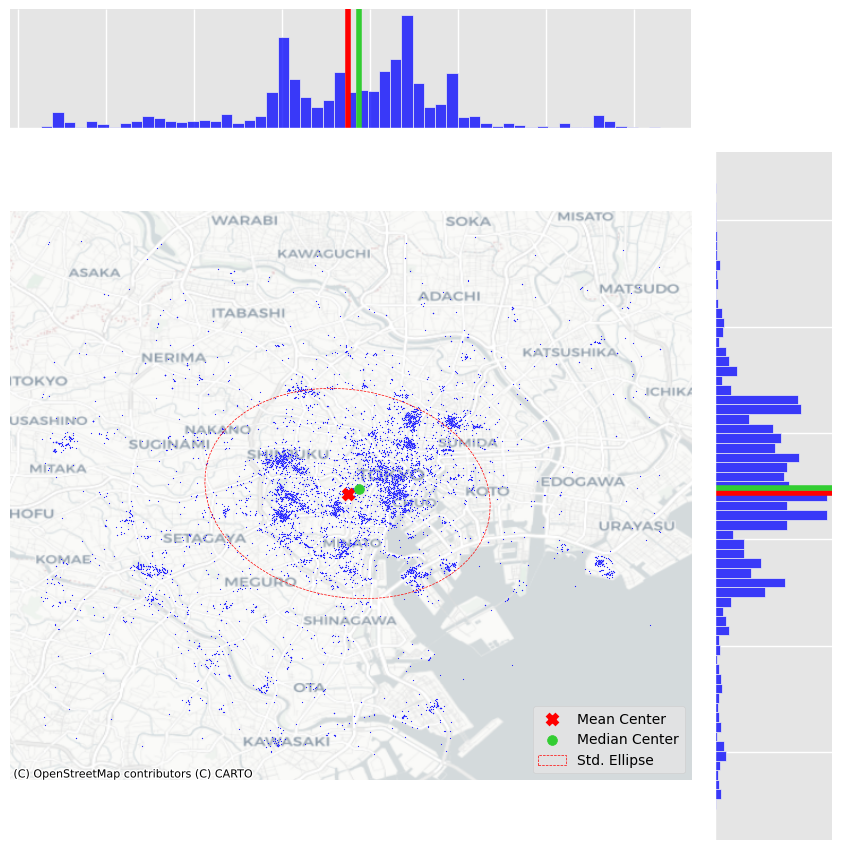
- Showing patterns as dots on a map - we can see dots tend to be concentrated in the center of the covered area in a non-random pattern. Furthermore, within the broad pattern, we can also see there seems to be more localized clusters.
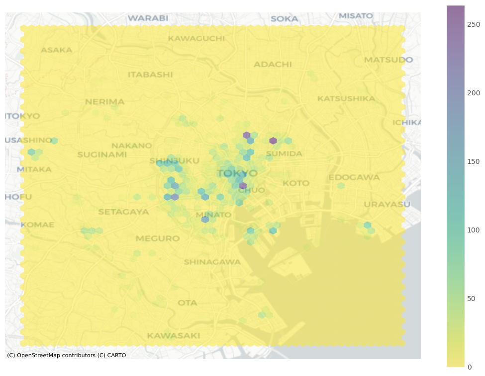
- Showing map - add geographical context by overlaying a tile map from the internet.
-
Showing density with hexbinning - This plot will give a solution to get around cluttering data. We can now recast this approach as a spatial or two-dimensional histogram. This allows a lot more detail! It is now clear that the majority of photographs relate to much more localized areas, and that the previous map was obscuring this.
-
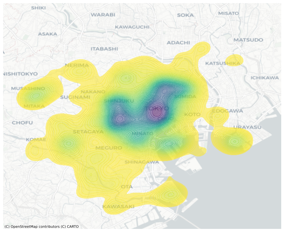
kernel density estimation - an empirical approximation of the probability density function. Instead of overlaying a grid of squares of hexagons and count how many points fall within each, a KDE lays a grid of points over the space of interest on which it places kernel functions that count points around them with a different weight based on the distance. The result is a smoother output that captures the same structure of the hexbin but “eases” the transitions between different areas. This provides a better generalization of the theoretical probability distribution over space.
- Centrography - Centrography is the analysis of centrality in a point pattern. If the hexbin above can be seen as a “spatial histogram”, centrography is the point pattern equivalent of measures of central tendency such as the mean. These measures are useful because they allow us to summarize spatial distributions in smaller sets of information (e.g., a single point). A common measure of central tendency for a point pattern is
its center of mass. there are some parameters such as:- mean center - or average of the coordinate values.
- median center - is analogous to the median elsewhere, and represents a point where half of the data is above or below the point and half is to its left or right.
in our data, The discrepancy between the two centers is caused by the skew; there are many “clusters” of pictures far out in West and South Tokyo, whereas North and East Tokyo is densely packed, but drops off very quickly. Thus, the far out clusters of pictures pulls the mean center to the west and south, relative to the median center.
-
Dispersion - This measure provides the average distance away from the center of the point cloud (such as measured by the center of mass). Another helpful visualization is the standard deviational ellipse, or standard ellipse. This is an ellipse drawn from the data that reflects its center, dispersion, and orientation.
- Extent - The last collection of centrography measures we will discuss characterizes the extent of a point cloud. Five shapes are useful, and they reflect varying levels of how “tightly” they bind the pattern.
- convex hull - the tightest convex shape that encloses the data.
- alpha shape - which can be understood as a “tighter” version of the convex hull.
- minimum bounding rectangles - the tightest rectangle that can be drawn around the data that contains all of the points. minimum bounding rectangle can be drawn just by considering vertical and horizontal lines.
- minimum rotated rectangle - provides a tighter rectangular bound on the point pattern, but the rectangle is askew or rotated.
- minimum bounding circle - the smallest circle that can be drawn to enclose the entire dataset.
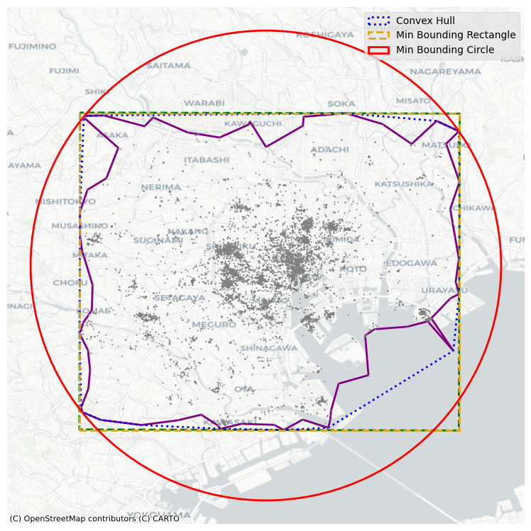 Each gives a different impression of the area enclosing the user’s range of photographs. In this, you can see that the alpha shape is much tighter than the rest of the shapes. The minimum bounding rectangle and circle are the “loosest” shapes, in that they contain the most area outside of the user’s typical area. But, they’re also the simplest shapes to draw and understand.