Geospatial Monitoring of Sustainable Development in Bolivia
geospatial
map
Sustainable Development
Introduction
Understanding regional development is crucial for shaping effective policies and ensuring balanced growth across a country. This article explores how sustainable development varies across Bolivia’s 339 municipalities, using geospatial analysis to uncover patterns, disparities, and trends.
By leveraging geospatial data, we aim to map, analyze, and classify municipalities based on their sustainable development performance. Our approach focuses on key spatial analysis methods —spatial dependence, inequality, and heterogeneity— to reveal regional patterns and their implications for policy prioritization.
Why This Matters
-
Data-Driven Policy Making: By identifying high-performing and underdeveloped regions, policymakers can target interventions where they are needed most.
-
Addressing Regional Disparities: Understanding spatial inequality helps in designing balanced development strategies that reduce the gap between urban and rural areas.
-
Customizing Development Strategies: Spatial heterogeneity analysis ensures that policies are tailored to the unique needs of each region, rather than applying a blanket approach.
By applying geospatial methods, we unlock deeper insights into Bolivia’s sustainable development landscape—guiding better decision-making for a more equitable future.
Key Areas of Analysis
-
Mapping the Spatial Distribution of Development The first step in our study is to visualize how sustainable development is distributed across Bolivia’s municipalities. Using geospatial tools, we create maps that show high-performing and low-performing areas, offering an intuitive view of regional disparities.
This mapping approach helps us answer questions such as:
- Where are the municipalities with the highest sustainable development index?
- Are there regions that consistently show lower development levels?
- How does population distribution correlate with development levels?
-
Spatial Dependence: Identifying Clusters and Outliers Sustainable development does not occur in isolation—neighboring municipalities often share similar characteristics due to factors like infrastructure, economic opportunities, and natural resources.
By applying spatial dependence analysis, we identify:
- Global clustering: Do high-development or low-development areas tend to cluster together at a national level?
- Local clusters: Specific hot spots (high-value clusters) and cold spots (low-value clusters) where development is significantly different from surrounding areas.
- Spatial outliers: Municipalities that stand out due to unexpectedly high or low development compared to their neighbors.
-
Spatial Inequality: Understanding Regional Disparities Not all regions develop at the same pace, leading to disparities in opportunities and living standards. Spatial inequality analysis allows us to quantify and decompose these disparities, helping policymakers pinpoint:
- Which regions experience the highest levels of inequality.
- Whether inequality is driven by urban-rural differences, economic activity, or infrastructure gaps.
- How sustainable development ranks differ across municipalities and departments.
-
Spatial Heterogeneity: How Relationships Change Across Space What drives development in one region may not be the same in another. Spatial heterogeneity analysis helps us understand how different factors influence development in various parts of Bolivia.
For example:
- Does population size always correlate with higher development, or does this vary by region?
- Do some municipalities benefit more from nighttime light intensity trends (a proxy for economic activity)?
- Are certain geographical features (e.g., proximity to borders or natural resources) influencing development in unique ways?
By identifying these regional variations, we move beyond one-size-fits-all conclusions and provide insights that tailor policy recommendations to specific areas.
Dataset
To conduct this study, we rely on a georeferenced dataset that includes:
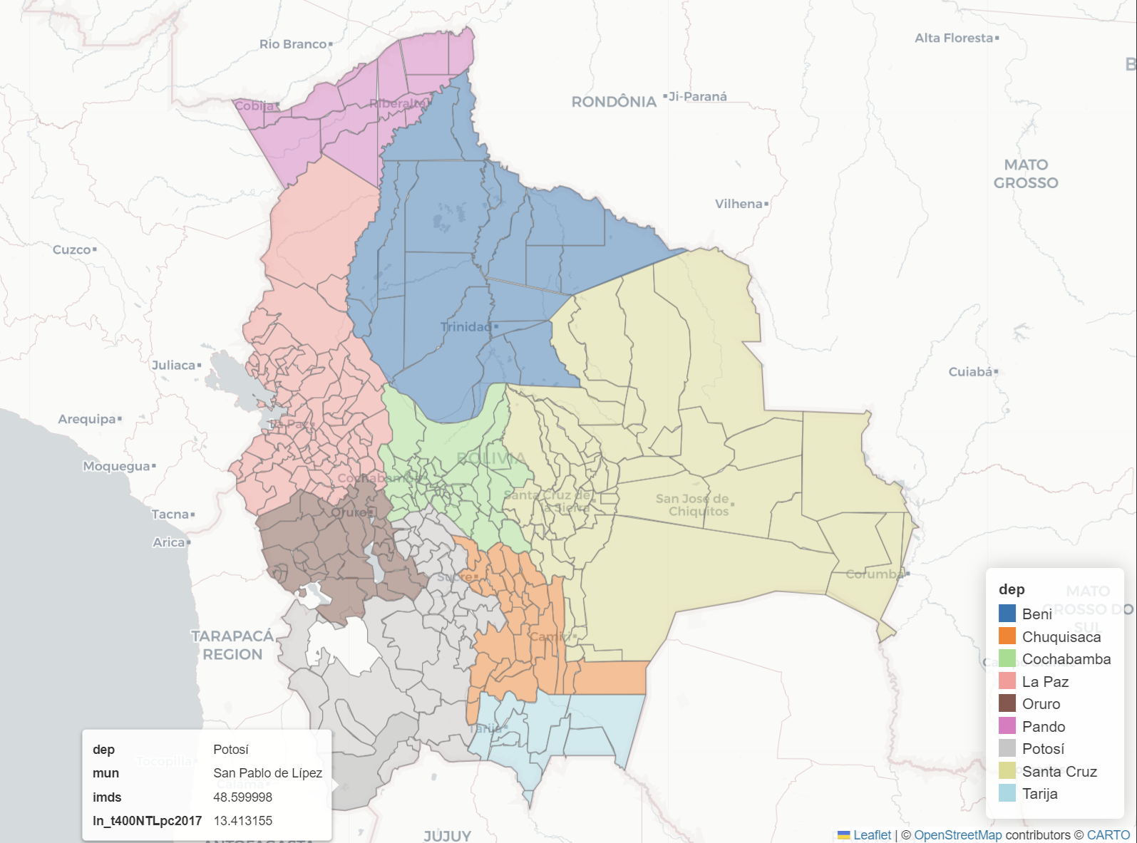
- Municipality and Department: administrative divisions.
- Bolivia Index Ranking: a composite ranking of municipalities based on sustainable development indicators.
- Population 2020 and Estimated Population 2020: official and projected population figures.
- Log Nighttime Light Per Capita (2020): satellite-based measure of economic activity and infrastructure presence.
- Trend in Log Nighttime Light Per Capita (2020): growth trends in nighttime illumination, indicating changes in economic activity.
- Municipal Sustainable Development Index: a key metric for evaluating municipal-level progress.
Load dataset
The data is stored in a GeoJSON file, allowing us to utilize GeoPandas for loading and processing. Additionally, we can load definition data if further context or explanation is required.
dataURL = 'map_and_data.geojson'
gdf = gpd.read_file(dataURL)

dataDefinitions = pd.read_csv('dataDefinitions.csv')
data_dict = dict(zip(dataDefinitions['Variable'], dataDefinitions['Label']))
we can store all required data into parameters for easier access.
INDICATOR1 = 'imds' # Municipal Sustainable Development Index
INDICATOR2 = 'pop2017' # Estimated population in 2017
INDICATOR3 = 'ln_t400NTLpc2017' # Trend log NTL per capita in 2017
INDICATOR4 = 'rank_imds' # Bolivia Index Ranking
INDICATOR5 = 'co2017' # Estimated carbon dioxide in 2017
ADM1 = 'dep' # Department ~ province
ADM3 = 'mun' # Municipality ~ city

gdf = gdf[[ADM1, ADM3, INDICATOR1, INDICATOR2, INDICATOR3, INDICATOR4, INDICATOR5,'geometry','COORD_X','COORD_Y']]
Exploratory data analysis (EDA)
EDA is the first step for every advanced analytics. This process will help us to understand and answer the 5W + 1H question before we expand our analytics.
Description analytics
describe.describe_data(gdf)
Table size 339 x 10
Dataframe has 10 columns.
There are 0 columns that have missing values.
| index | Data Type | Count | Missing | % missing | Low value | Q1 | Mean | Median | Q3 | Hi value | Mode | Stddev | Skewness | Skewness note | Uniques | |
|---|---|---|---|---|---|---|---|---|---|---|---|---|---|---|---|---|
| 0 | dep | object | 339 | 0 | 0 | 0 | 0 | 0 | 0 | 0 | 0 | 0 | 0 | 0 | non-numeric | 9 |
| 1 | mun | object | 339 | 0 | 0 | 0 | 0 | 0 | 0 | 0 | 0 | 0 | 0 | 0 | non-numeric | 333 |
| 2 | imds | float64 | 339 | 0 | 0 | 35.7 | 47 | 51.05 | 50.5 | 54.85 | 80.2 | 47.5 | 6.77 | 0.59 | Moderately Positively Skewed | 188 |
| 3 | pop2017 | float64 | 339 | 0 | 0 | 661.82 | 6425.71 | 32858.8 | 11627.5 | 22497.3 | 1.60446e+06 | 661.82 | 117649 | 9.71 | Highly Positively Skewed | 339 |
| 4 | ln_t400NTLpc2017 | float64 | 339 | 0 | 0 | 7.87 | 12.82 | 13.67 | 13.7 | 14.65 | 16.99 | 7.87 | 1.28 | -0.54 | Moderately Negatively Skewed | 339 |
| 5 | rank_imds | int32 | 339 | 0 | 0 | 1 | 85.5 | 170 | 170 | 254.5 | 339 | 1 | 98.01 | 0 | Fairly Symmetric (Positive) | 339 |
| 6 | co2017 | float64 | 339 | 0 | 0 | 400.05 | 402.91 | 403.59 | 403.67 | 404.56 | 406.23 | 400.05 | 1.23 | -0.55 | Moderately Negatively Skewed | 339 |
| 7 | geometry | geometry | 339 | 0 | 0 | 0 | 0 | 0 | 0 | 0 | 0 | 0 | 0 | 0 | non-numeric | 339 |
| 8 | COORD_X | float64 | 339 | 0 | 0 | -69.48 | -67.87 | -66.07 | -66.18 | -64.62 | -57.69 | -69.48 | 2.15 | 0.8 | Moderately Positively Skewed | 339 |
| 9 | COORD_Y | float64 | 339 | 0 | 0 | -22.67 | -18.88 | -17.45 | -17.59 | -16.48 | -10.11 | -22.67 | 2.35 | 0.75 | Moderately Positively Skewed | 339 |
Using the information above we found that:
- There is no missing value in our dataset.
- The dataset includes 9 departments (provinces in Indonesian terms) and 333 municipalities (cities in Indonesian terms).
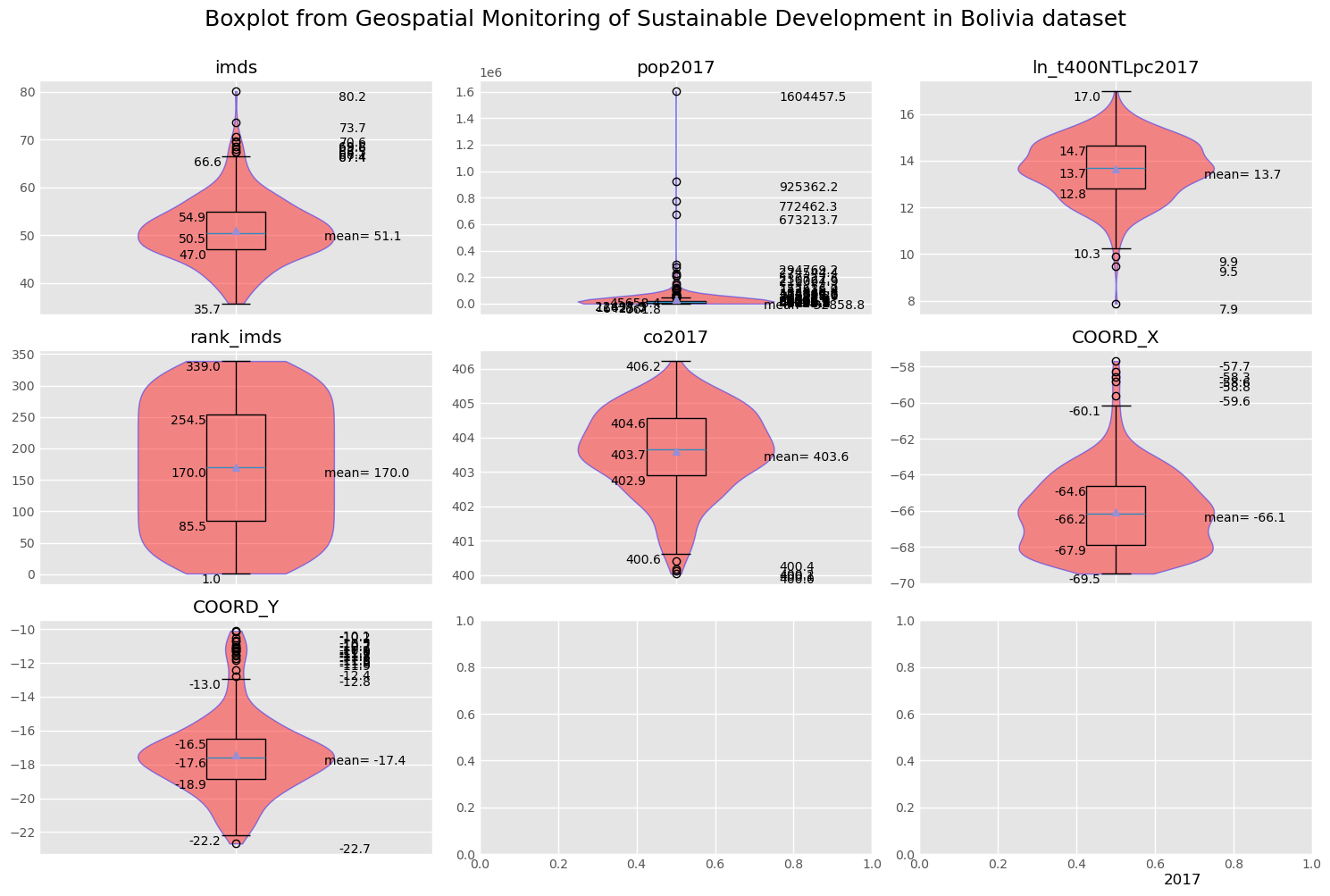
- The Municipal Sustainable Development Index (IMDS) exhibits a moderately positive skew, indicating that most values are concentrated toward the lower end of the distribution. The standard deviation is approximately 6.77, with the mean and median being nearly equal, suggesting minimal variation across rows.
- The estimated population in 2017 (pop2017) shows a highly positive skew, which aligns with geographic differences, particularly between urban areas and large cities.
- The trend of logarithmic nighttime light per capita in 2017 (ln_t400NTLpc2017) presents a moderately negative skew, implying that nighttime light intensity is relatively high in certain locations. However, the variation in values across rows remains small.
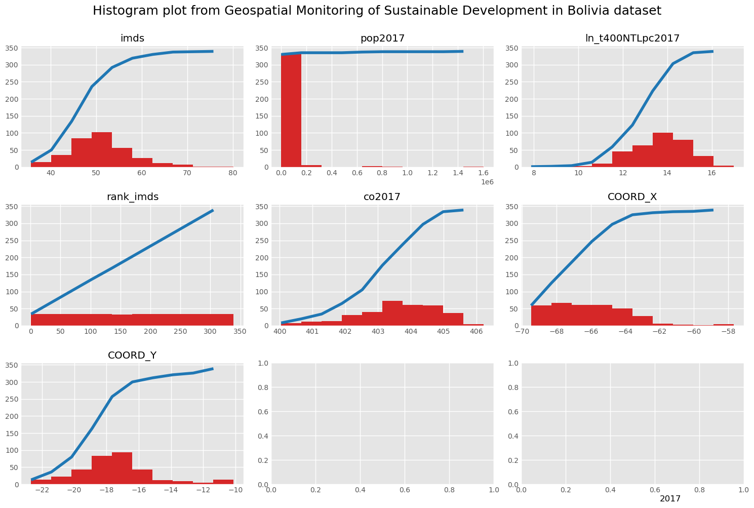
Boxplot and Histogram plot
To get more conprehensive insight about our distribution data, we can make a boxplot and histogram to get more clearer view how our data is.
visual.boxplot(gdf,[INDICATOR1,INDICATOR2,INDICATOR3, INDICATOR4,INDICATOR5,'COORD_X','COORD_Y'],row_col=(3,3),title="Geospatial Monitoring of Sustainable Development in Bolivia",footnote='2017')
Numeric Descriptive
Boxplot Comparison
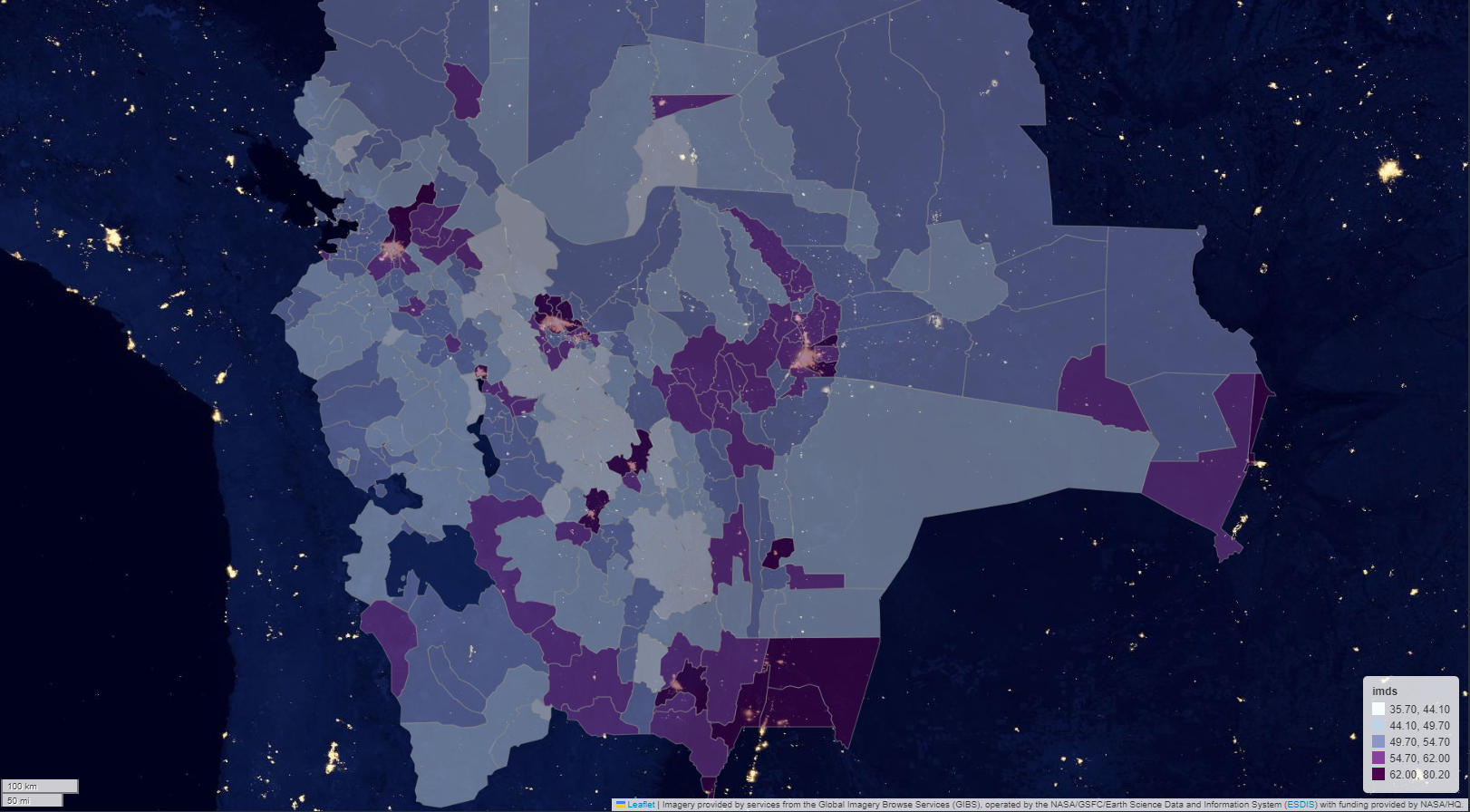
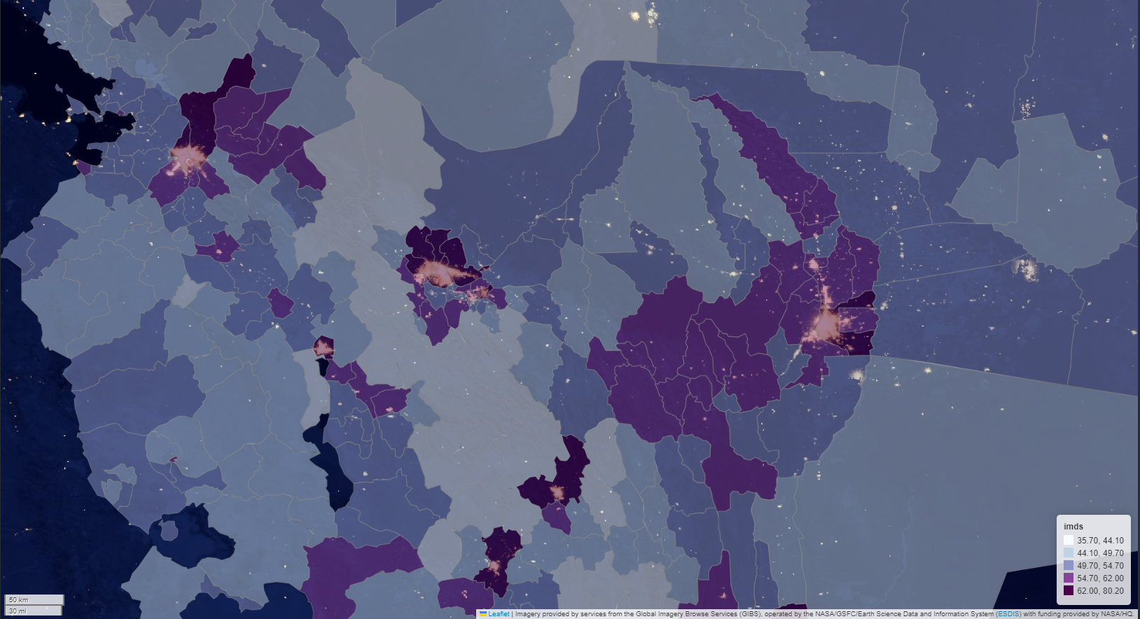
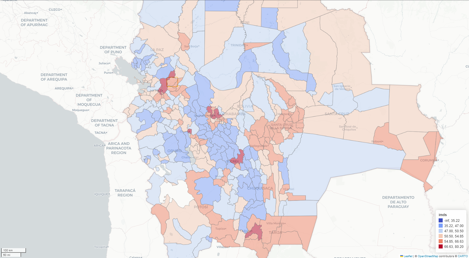
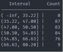
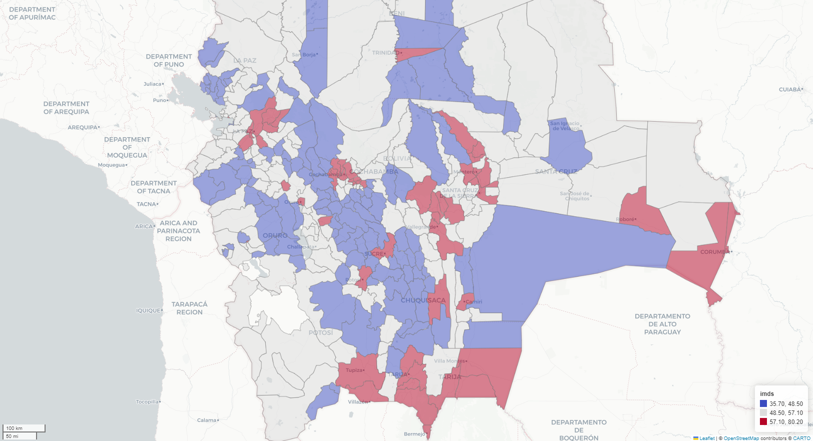
Choropleth map
Histogram distribution
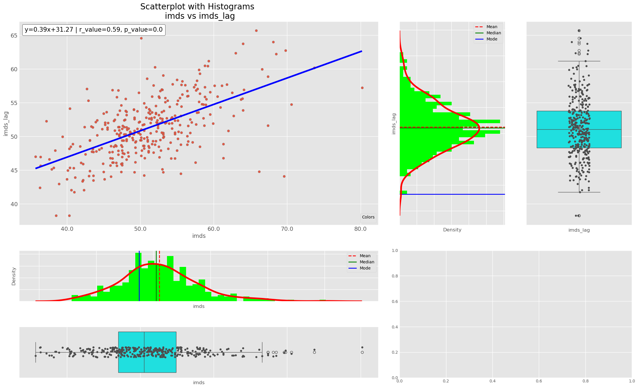
Scatter plot, box and distribution (pop2017_log vs imds)
Choropleth map for imds compare to night light area
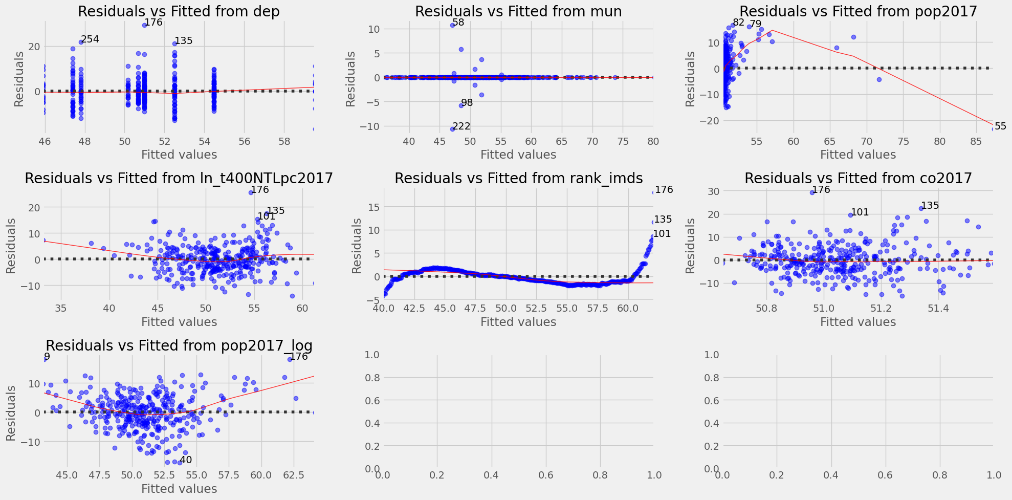
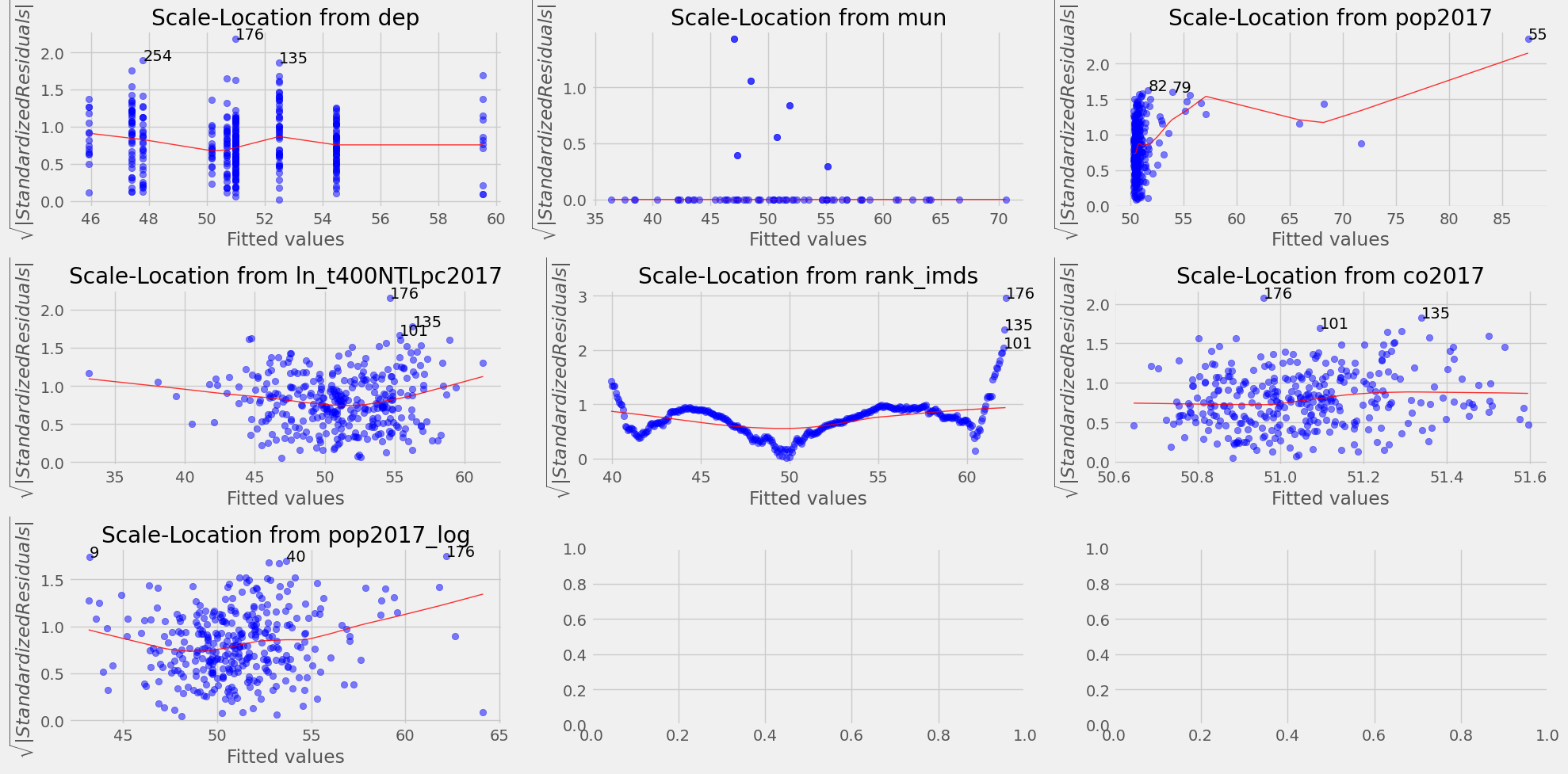
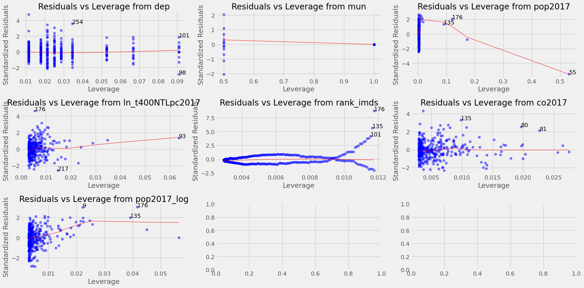
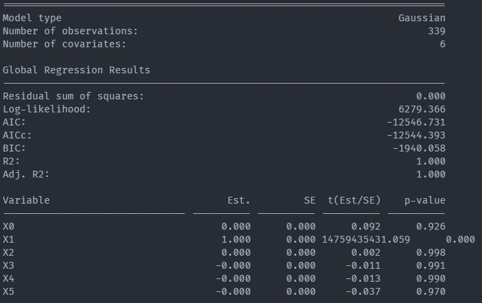
Residuals vs Fitted for Linear regression (imds vs dep, mun, pop2017, ln_t400NTLpc2017, rank_imds, co2017, pop2017_log)
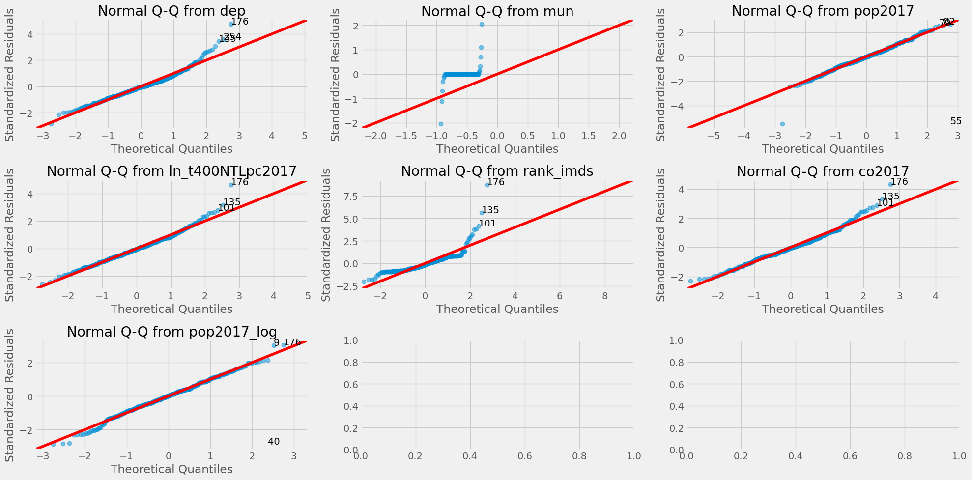
QQ plot
Scale-Location Plot
Leverage plot
Exploratory spatial data analysis (ESDA) - Box plot
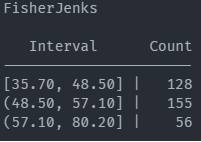
Exploratory spatial data analysis (ESDA) - Fisher Jenks plot
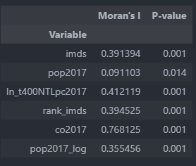
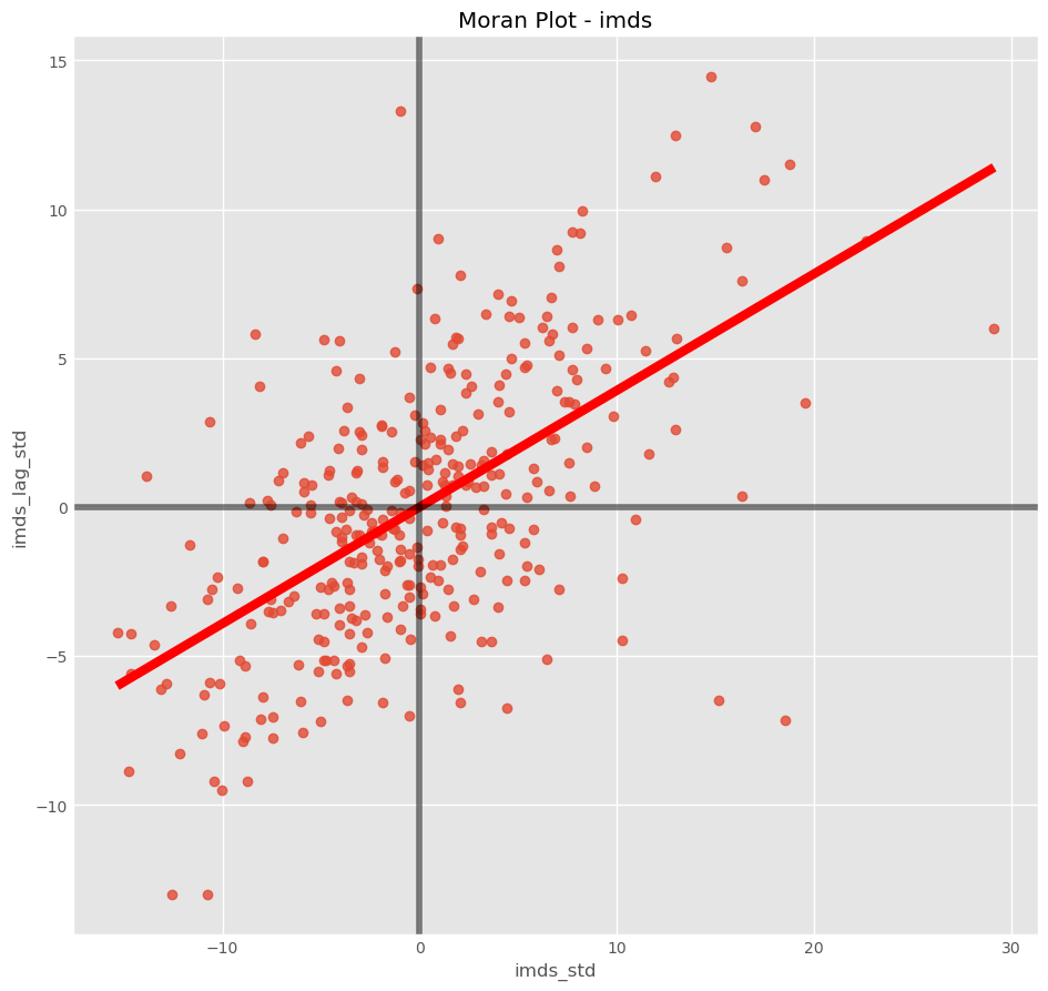
spatial autocorrelation multivariable
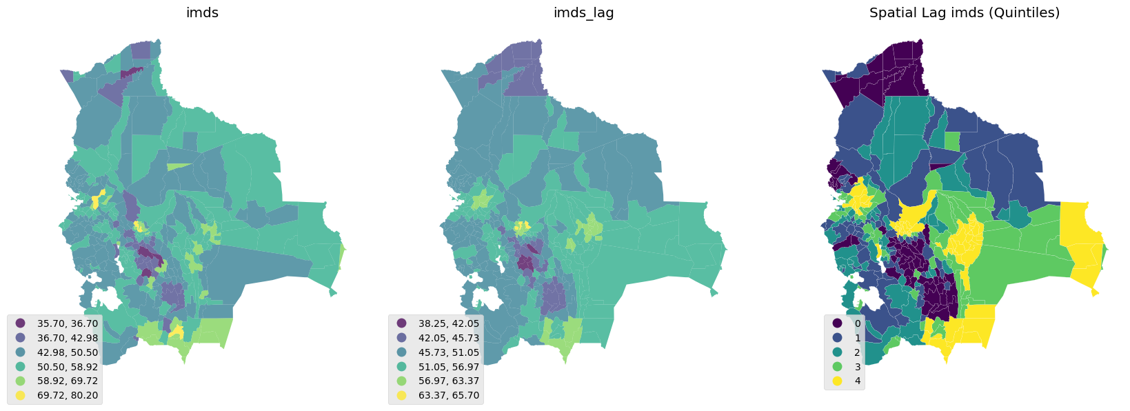
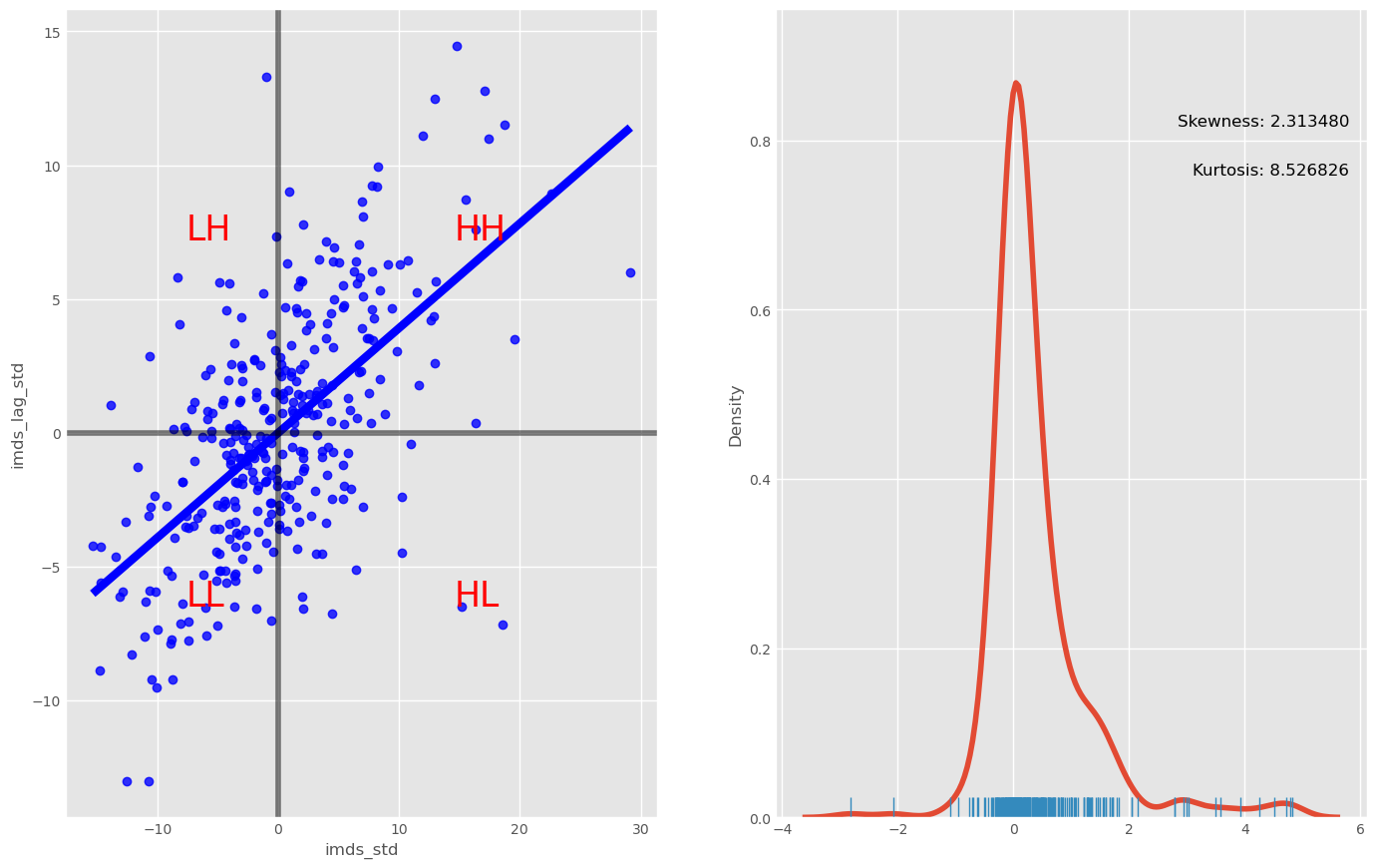
Scatter plot, box and distribution (imds vs imds lag)
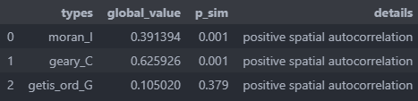
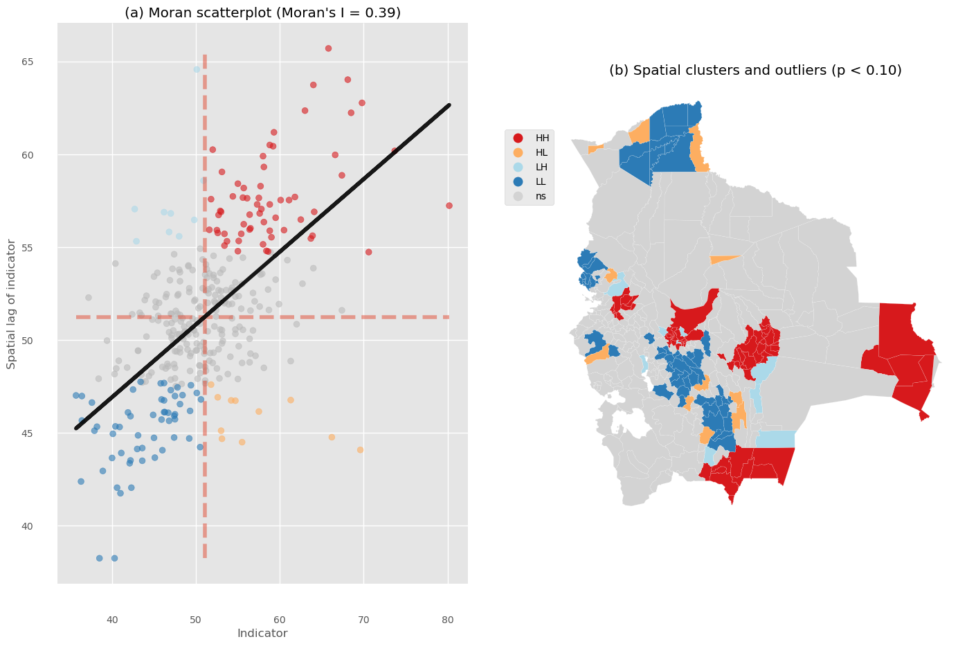
Spatial Autocorrelation Global
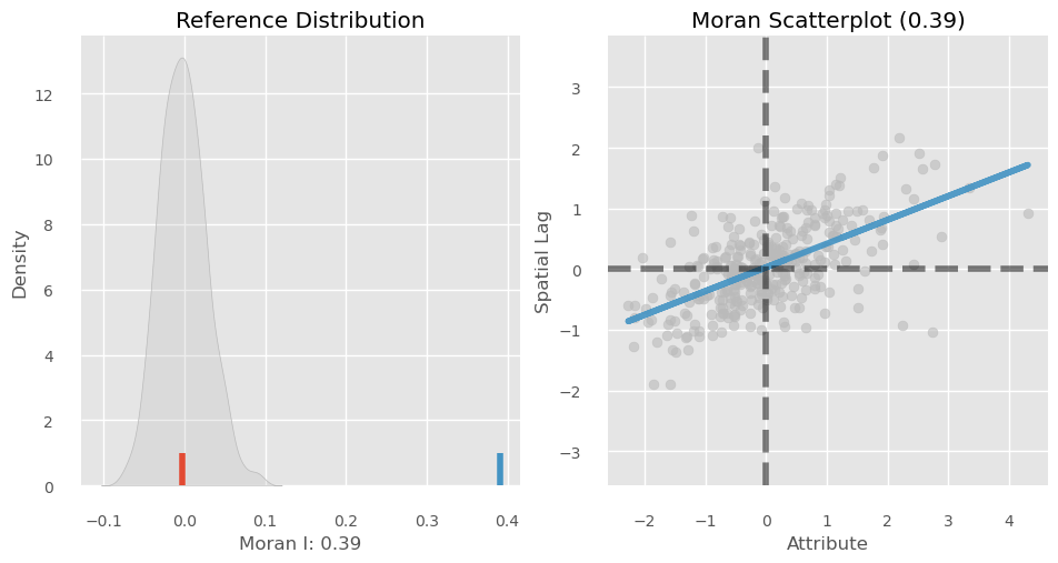
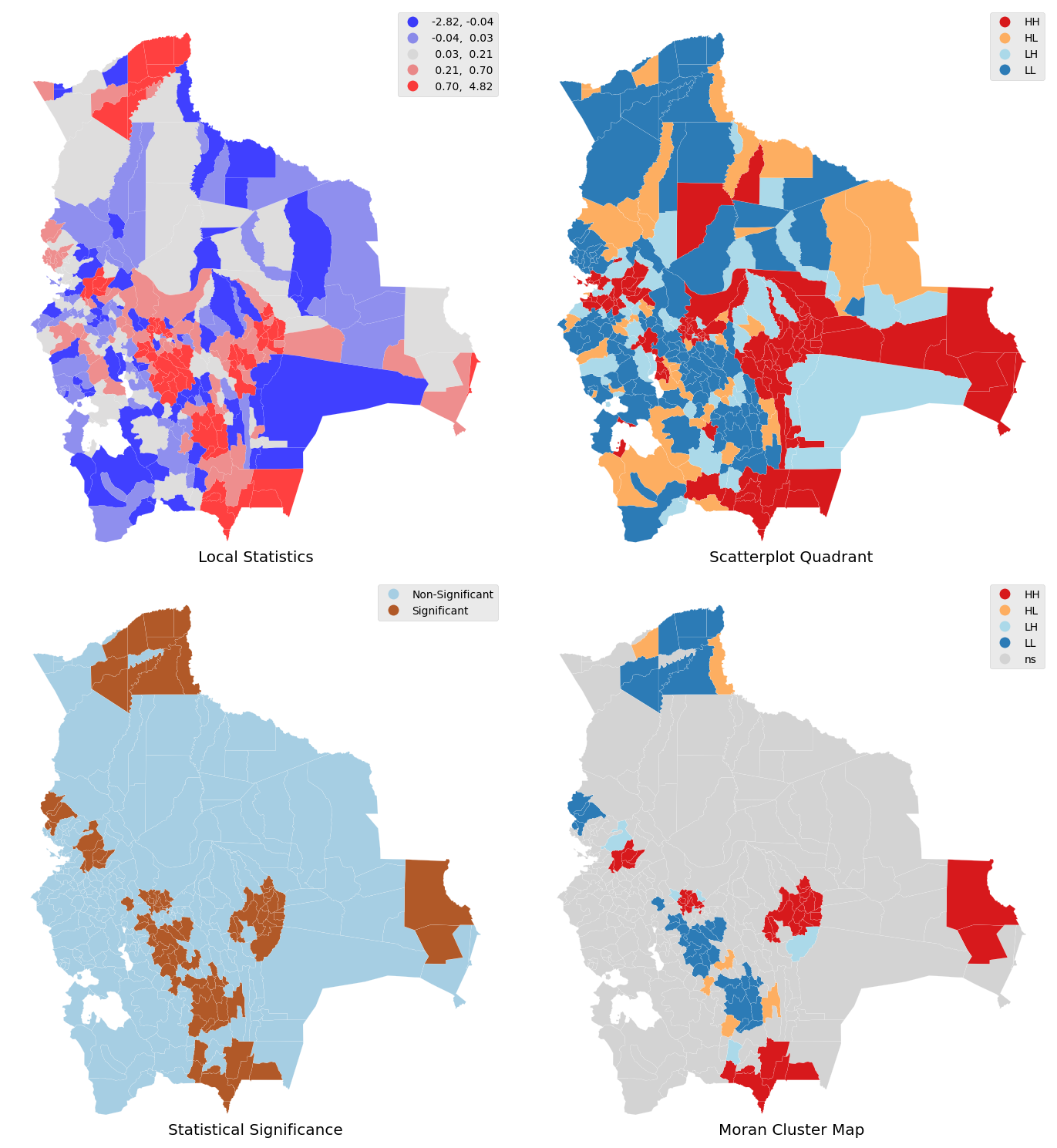
Spatial Autocorrelation Local
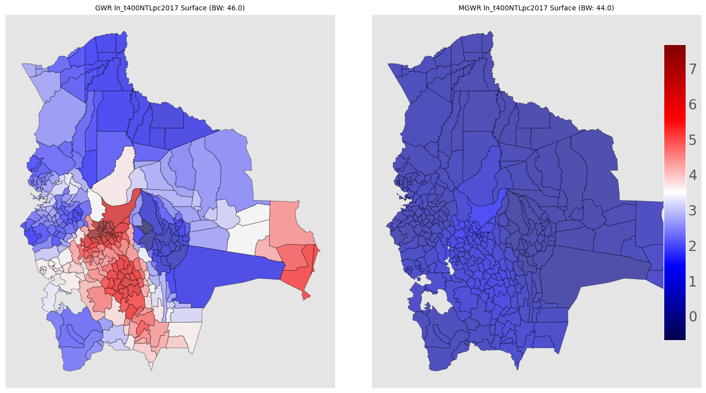
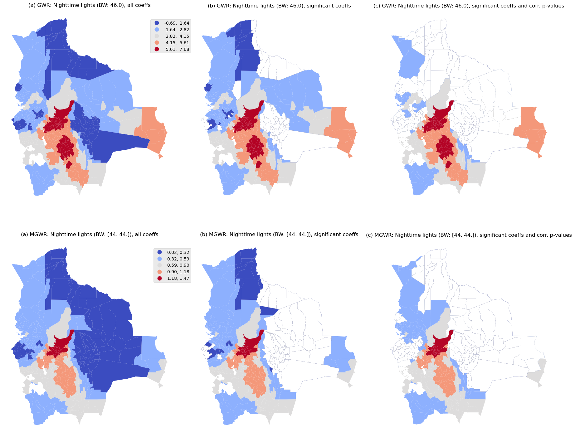
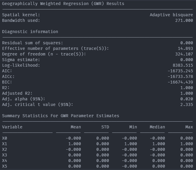
Geospatial Weight Regression (GWR) analysis
Exploratory spatial data analysis (ESDA) - Fisher Jenks plot for GWR R2
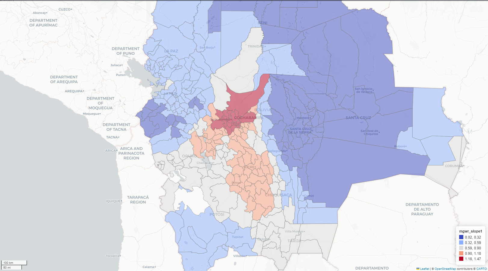
Exploratory spatial data analysis (ESDA) - Fisher Jenks plot for GWR Slope
Exploratory spatial data analysis (ESDA) - Fisher Jenks plot for MGWR Slope