Analyzing spatial and temporal patterns
arcgispro
geospatial
map
esri
Crime mapping analysts can use GIS to identify spatial patterns to gain a better understanding of the role of location, proximity, and opportunity while providing key decision-makers with information to put crime prevention solutions in place.
Time is an important variable in analyzing crime. When using temporal data — in this case, crime incidents collected at a specific location and specific time — it is possible to see how patterns of crime shift over time and geography. If data is collected or surveyed to represent an instance in time—over the course of one day, one month, one year—the inclusion of time in a dataset’s attributes gives temporal data the necessary information for a GIS to perform spatial and temporal analysis.
Study case scenario
We work as a crime analyst for the City of Philadelphia, and our role is to use GIS to examine criminal activity over time. We will do this by identifying crime hot spots and locating where those hot spots have gotten worse over time to help create spatially targeted crime prevention plans. Using a list of crime incidents that include temporal data—that is, data that has a time attribute — we will isolate a specific type of crime and create map layers that show crime locations as well as create crime hot spots.
The Dataset
In this project we will use CrimeIncidents geodatabase — a feature class that represents crime incidents for the year 2014 in the City of Philadelphia (Source: City of Philadelphia Police Department). This dataset contain both spatial and temporal data that we can use to analyze spatial and temporal patterns.
This dataset contains crimes for the 2014 calendar year in the city of Philadelphia, Pennsylvania. The table lists 74,011 crime incidents, which are represented at a per block group address level, not as an actual address. This layer of anonymity protects the privacy of those involved with each incident.
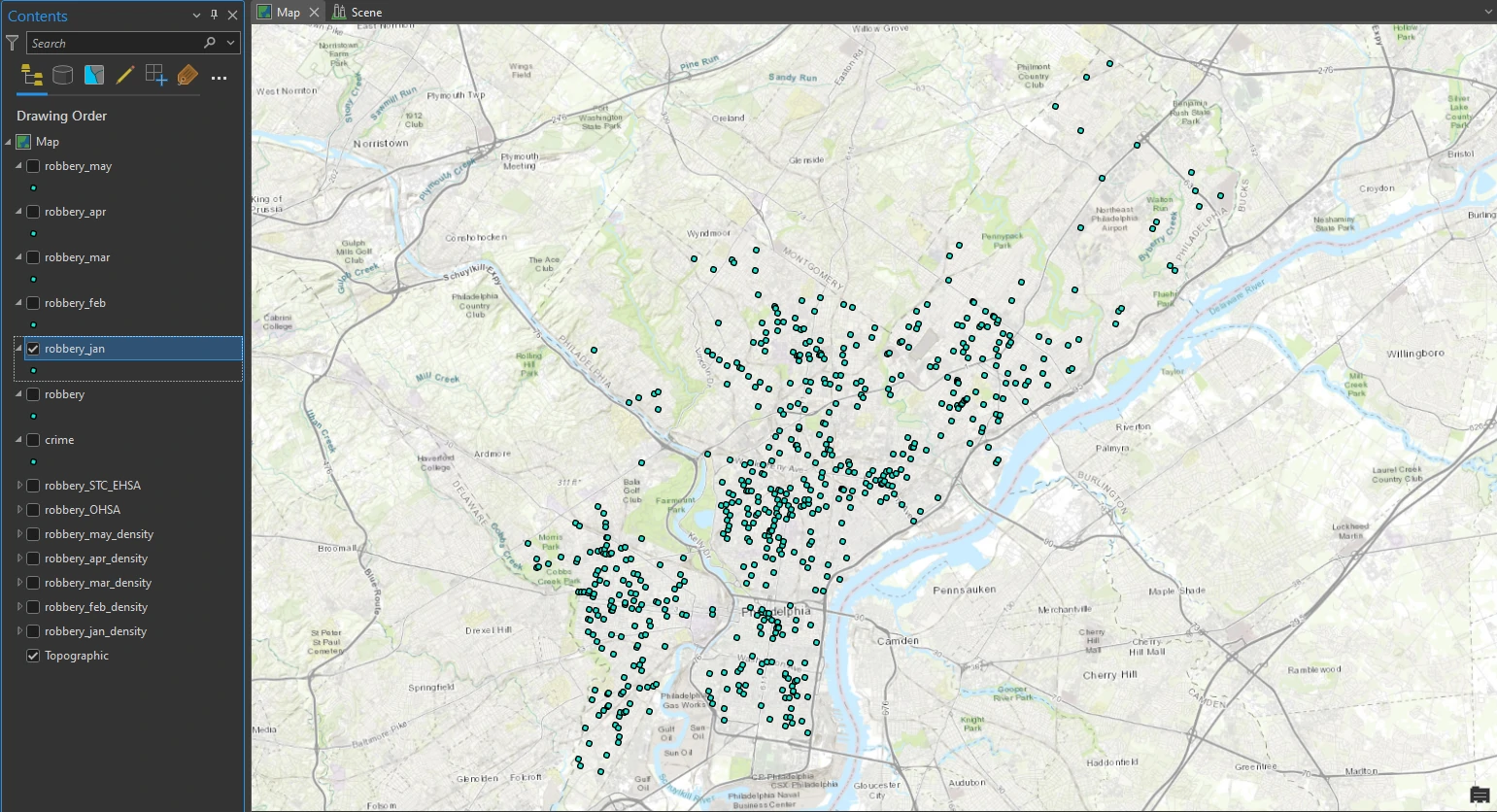
In addition, names and other identifiable information are not included with an incident. Notice the dispatch date and dispatch time attributes for each record. Although it is entirely possible to create a day-by-day temporal map with this level of data granularity, we will instead create a series of temporal maps for each month and use it in a time animation. Next, we will focus on one type of crime: robberies, with and without a firearm. To perform this analysis, we will first extract data by crime type.
Filtering the data
In this part we will explore the crime layer of crime incidents and look more closely at its attributes, create kernel density layer to approximate crime hot spots.
First, we select By Attributes or definition query on our data to get crime data record only for Robbery Firearm and Robbery No Firearm.
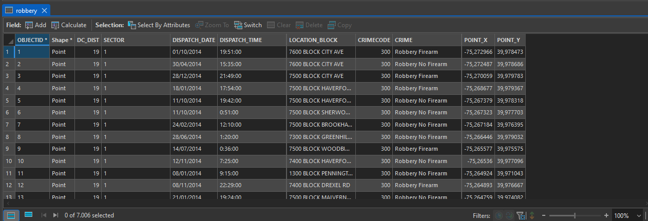
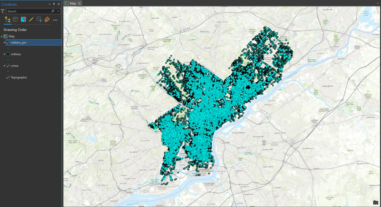
Exactly 7,006 robbery points are selected on the map, and representing robberies committed with and without firearms. Next, we will create a feature layer from the selection, in which we will work to extract robbery crimes by month.
Next, we will filter for each month to get temporal data. We select DISPATCH_DATE from each of start month and end month to get monthly temporal crime data. For now we focus on january and we got exactly 640 robbery incidents during the month of January are selected on the map.
Create a kernel density
A kernel density calculates the density of features within an area around those features and is one of the most common techniques in crime mapping.
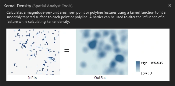
To do that, we can utilize Kernel Density tool at Analysis tab. By this tool we will set parameters as follow:
- Population Field = NONE
- Area Units = Square Miles
- Retain the other default parameters
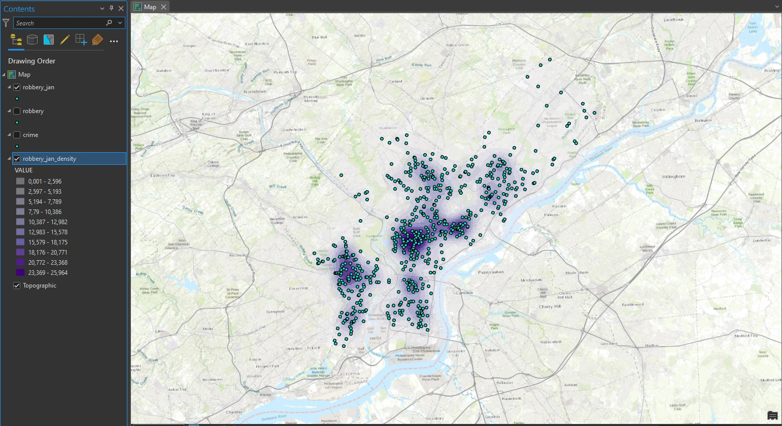
The kernel density is calculated and added to the map. The density is automatically classified with 10 classes. This map help use to examine clearly at high density location.
Perform a hot spot analysis
In this part, we will run the Optimized Hot Spot Analysis tool to find statistically significant hot spots and cold spots of robberies. We will also create a space-time cube, a data pattern mining tool, to look for trends over time.
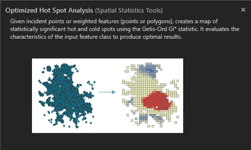
To do this, we can utilize Optimized Hot Spot Analysis on the Analysis tab. The result can be shown below.
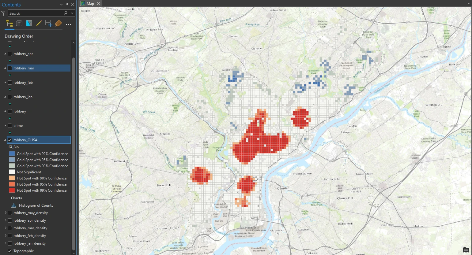
The tool aggregated robbery incidents into weighted features and analyzed their distribution to identify an appropriate scale of analysis. It then determined which areas are significant, including areas that are hot (large clusters symbolized in red) and cold (smaller clusters symbolized in blue). Areas that are not significant are symbolized in white.
From this result we can make some assumptions used in statistics. We are essentially asking the questions:
Is this pattern the result of random spatial processes? How likely is it that this pattern is random?
The initial assumption in this cluster analysis is that crime clusters happen in specific areas of the city and are not random. When it is very unlikely that the pattern is random, we reject the null hypothesis —which, in this case, is complete spatial randomness— and we can feel confident that the patterns we are seeing are evidence of underlying spatial processes.
In other words, we have found statistically significant clusters of both high and low values that we can trust, and we can begin to ask questions as to why they occur, thereby rejecting the null hypothesis.
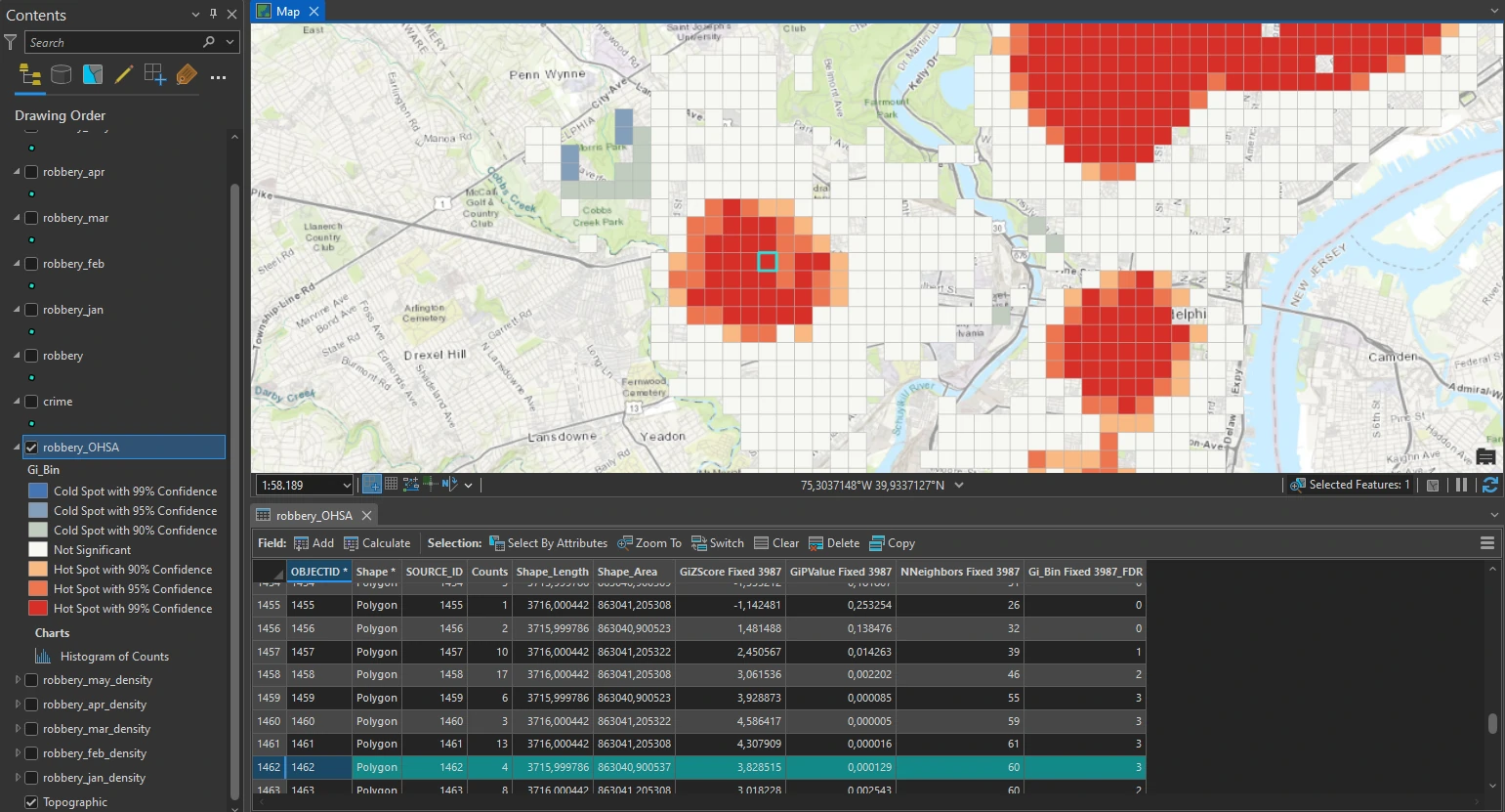
The intensity of robbery clustering is determined by the z-score returned in the output. Z-scores are standard deviations and are represented in the table as the attribute GiZscore Fixed 3987. As an example, a z-score of +2.5 means that the result is 2.5 standard deviations and is at a high confidence level (greater than 95 percent), typically indicating statistically significant clustering.
For the red area, most likely, the z-score of the selected cell is greater than +2.5. However, the p-value is a very low number, close to zero. The p-value represents the probability that the observed spatial pattern was created randomly. A very small p-value means that it is highly unlikely that the observed spatial pattern is the result of random processes. This small pvalue can be an indication that robbery incidents are not entirely random and that many contributing factors can lead to their occurrence, such as socioeconomic factors in low-income neighborhoods.
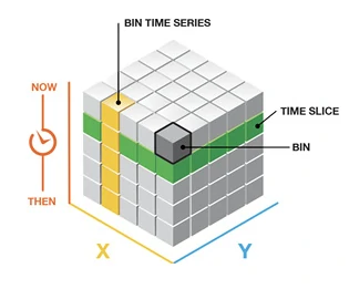
Create a space-time cube
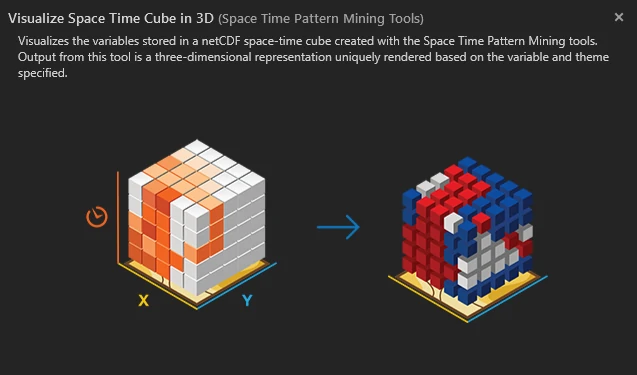
The Create Space Time Cube tool summarizes the set of robbery incidents into a data structure by aggregating them into space-time bins. These bins can be viewed in 2D or 3D. Each bin contains the robbery points for a certain month, and the pattern of incidents over time is analyzed for all locations. Creating a space-time cube can help us aggregate the robbery points, and visualizing it will help us understand how the robbery data is distributed over a geographic area. A set of points can be summarized into a data structure by aggregating them into space-time bins that form a cube.
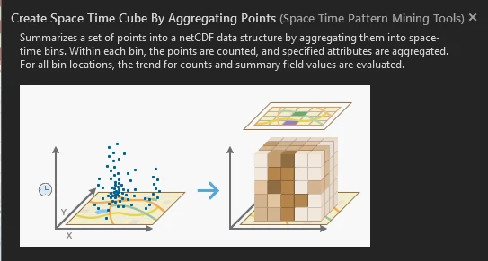
To do this we can utilize the Create Space Time Cube by Aggregating Points tool In the Geoprocessing pane. The output of this tool is called Space Time Cube with extension .nc. The .nc file extension stands for the netCDF format (network Common Data Form) and is primarily used for storing multidimensional data such as temperature, but it can also be used for other data types.
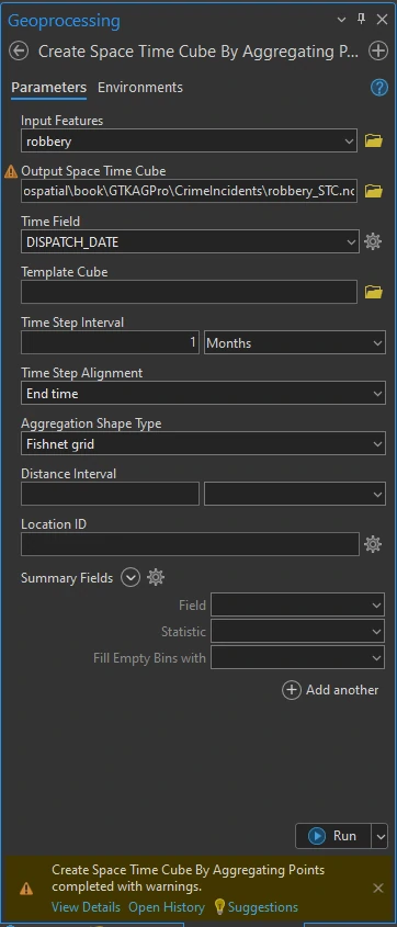
The setting and result process can we shown above. In the message at the below image, it provides insight into what was created, including the number of locations, the geographic size of each location, the total geographic size, and the number of time intervals.
Visualize a space-time cube
To visualize The space-time cube above, we will be rendered in 3D, so we will create a 3D scene. Before we do that we need to remove elevation surfaces layer. This because instead of elevation, time is being used as the vertical axis in visualizing the robbery space-time cube. By removing the service that provides elevation data, all the time values will start on the ground and at the same base, with an elevation equal to zero.
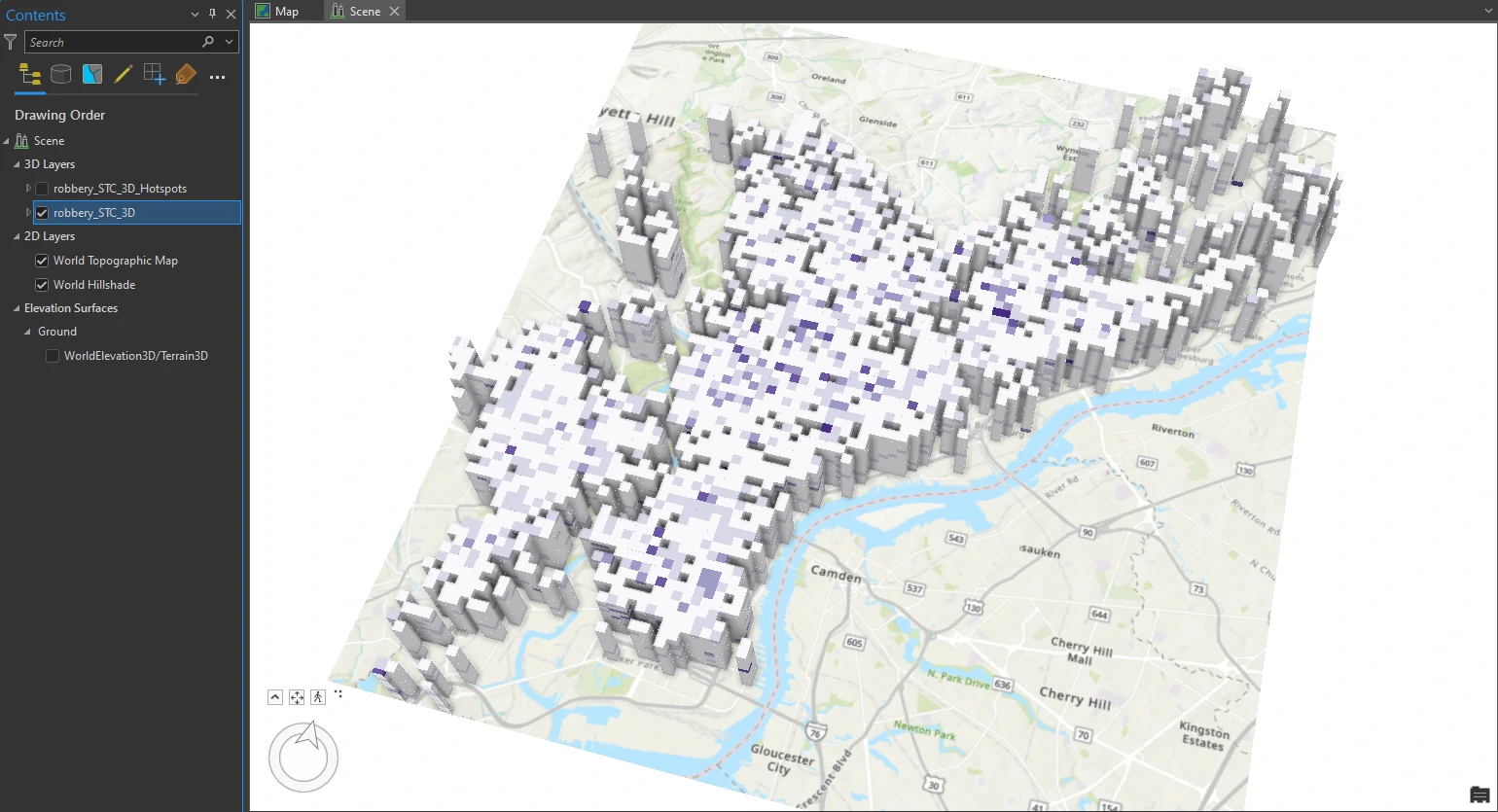
Next, we can use Visualize Space Time Cube in 3D tool in the Geoprocessing pane. And we will set these parameters on this tool:
- Cube Variable = COUNT (The Count display variable shows the density of the robbery counts in each space-time bin)
- Display Theme = Value
- Output Features name = robbery_STC_3D
The result visualization can be shown below.
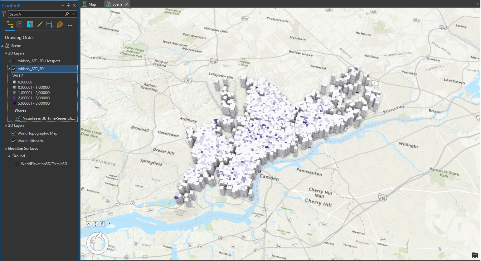
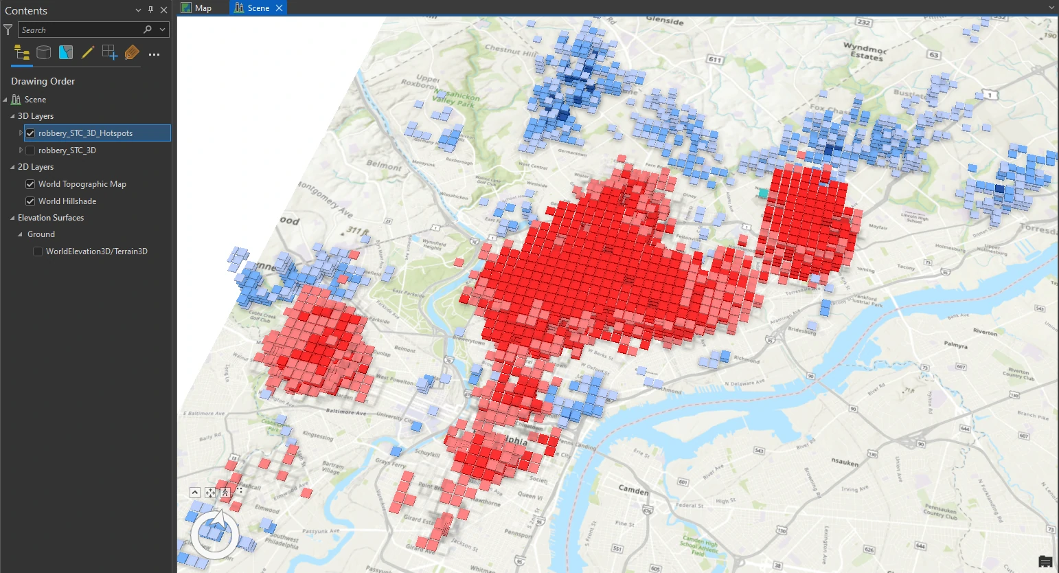
In this result each block contains 12 intervals, each representing a month. With the darker intervals show higher counts. Although looking at the space-time cube alone provides some hints on the clustering of robberies, it is not conclusive. We will use another tool that specifically identifies trends in the clustering of space-time point data for a more detailed perspective.
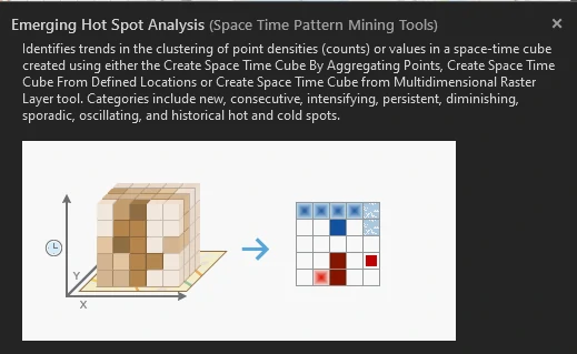
Run the Emerging Hot Spot Analysis tool
The Emerging Hot Spot Analysis tool identifies hot spot and cold spot trends in our data. It essentially provides a hot spot analysis like the one at the start of this project with additional in temporal data.
Next, we can use Emerging Hot Spot Analysis tool in the Geoprocessing pane. And we will set these parameters on this tool:
- Analysis Variable = COUNT
- Output Features name = robbery_STC_EHSA
The result visualization can be shown below.
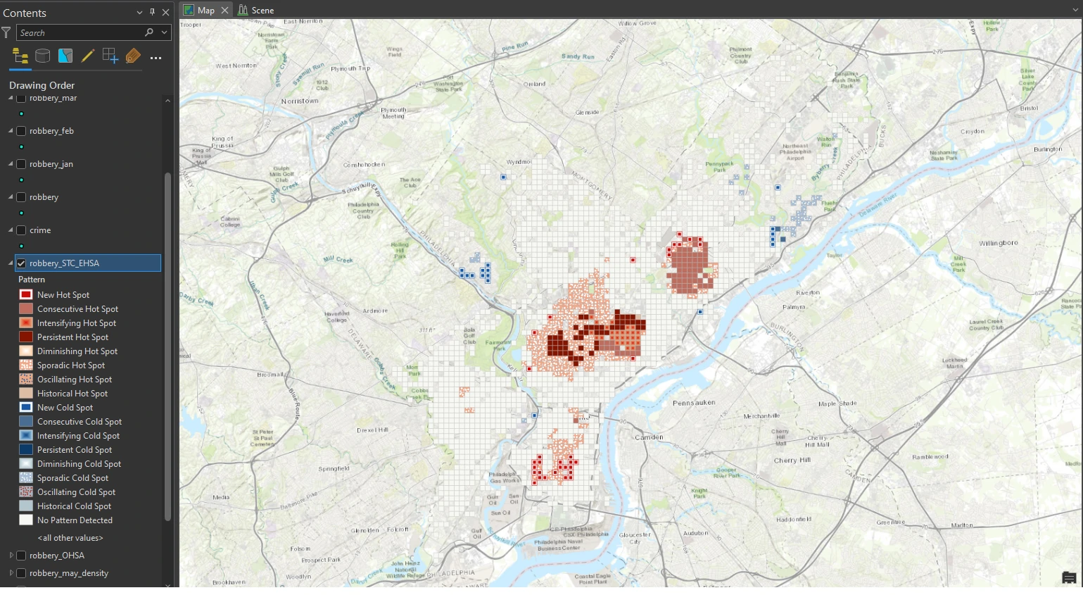
The tool returns many patterns listed to categorize the locations in output layer. Remember that the Emerging Hot Spots Analysis tool accounts for space and time and analyzes all robbery incidents to determine whether clustering is statistically significant.
We can examine more by select Persistent Hot Spot and review the pop-up. In this classification, a persistent hot spot is a location that has been a statistically significant hot spot for 100 percent of the time-step intervals with no discernible trend indicating an increase or decrease in the intensity of clustering over time. This hot spot classification means that robberies in this area are frequent and concentrated.
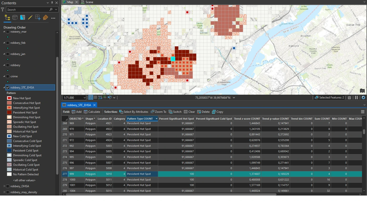
Second, we can select a location that is classified as Intensifying Hot Spot and review the pop-up. An intensifying hot spot is a location that has been a statistically significant hot spot for 90 percent of the time-step intervals. It is an area in which there has been an increase in the intensity of clustering over time and is statistically significant. The spatial correlation between intensifying hot spots and persistent hot spots is not random. Crime can have a spreading trend, which may be what is happening here.
Lastly, we can select a location that is classified as New Hot Spot and review the pop-up. This area has many locations classified as new hot spots. A new hot spot is a location that is a statistically significant hot spot for the final time step and has never been a statistically significant hot spot before.
Although many factors can cause this area to become a significant cluster, the map can be used to help determine what is causing the increase in robberies during this time interval.
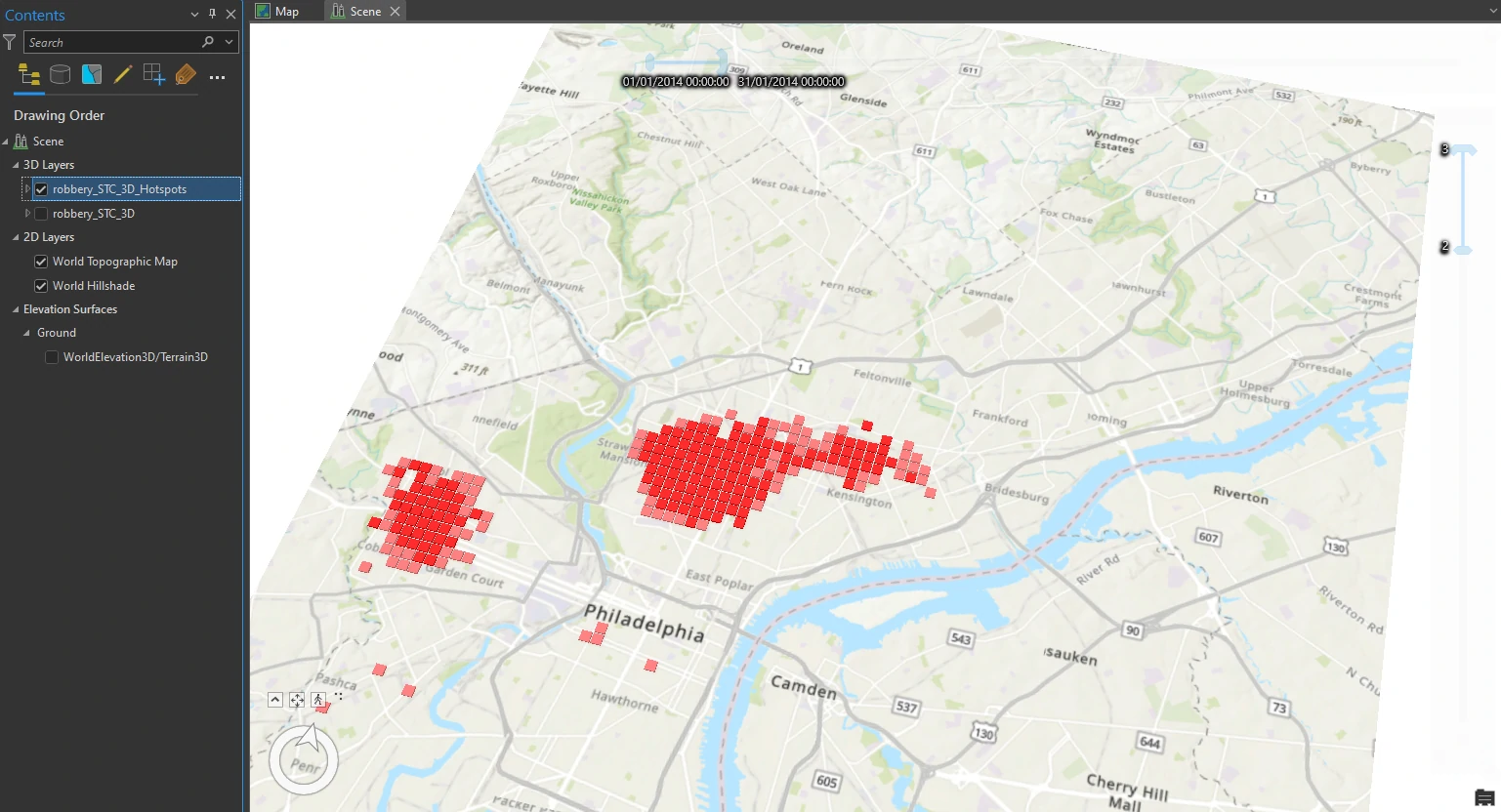
We can also visualize this result with 3D model using Visualize Space Time Cube in 3D tool. And we will set these parameters on this tool:
- Display Theme = Hot and Cold Spot Results
- Output Features name = robbery_STC_3D_Hotspots
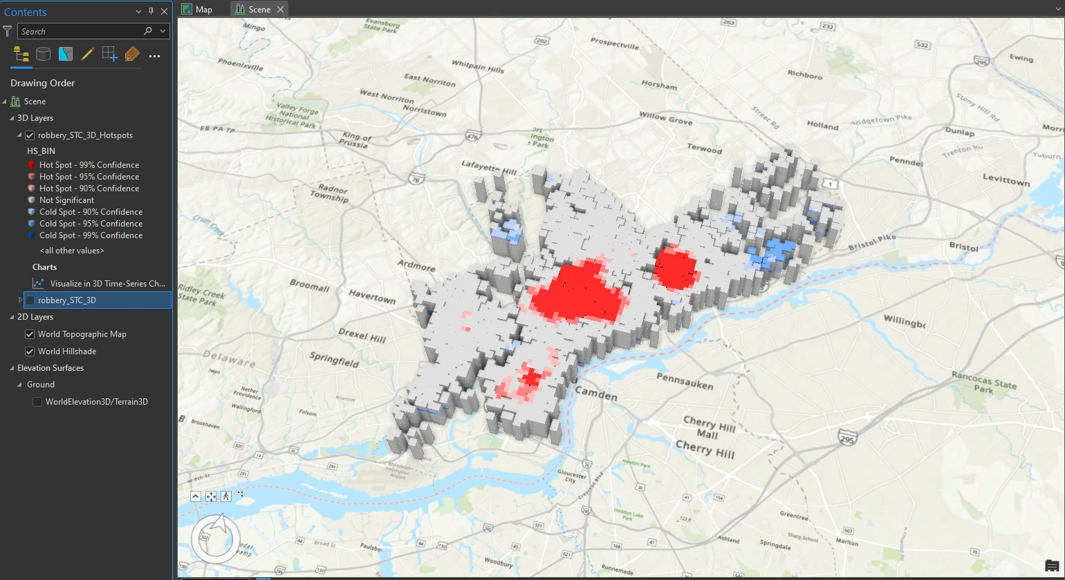
Explore the results in 3D
Clip Layer
To get more focus on the selected visualization, we can clip our layer to a custom Extent that keep our data and basemap and remove all other unused basemap. To do this we can utilize Clip to a Custom Extent On the Clip Layers tab.
Change 3D visualization styling
Next, we can extend our analysis by highlighting significant data points and suppressing those that lack statistical relevance. To do this we can use the attribute-driven property settings with constant values. We will use this third option because it is easy to access from the Symbology pane and will not change the legend in the Contents pane.
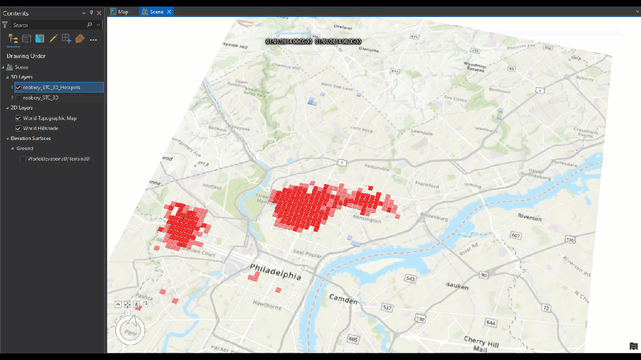
Animate the data
In this last part of this project, we can create animation of our data. For temporal data, The robbery incidents layer includes a DISPATCH_DATE attribute that we can use to indicate time and we will use monthly layer data that we create at previous topic.
To do this we can utilize Filter Layer Content Based on Attribute Values on the Time tab. And we will set these parameters on this tool:
- Layer Time = Each Feature Has Start and End Time Fields
- Start Time Field = Start Date
- End Time Field = End Date
- auto-generate parameter at Time Extent by click calculate button. The Calculate button ensures that the full time extent—start time and end time—is specified.
After we run this tool, a bar appear near the top of the map or a small box in the upper-right corner of the map that says Time. This Time slider indicates that the map has successfully detected the temporal data that we specified. Next we can manually create animation crime data monthly (or other granular time).
Animate using the Range slider
Beside time animation, we can enable the range of values from an attribute. In this case, we will use the Hot Spot Analysis Bin (Count) attribute, which is the confidence level indicated in the legend. It ranges from −3 to +3, with zero classified as Not Significant.
To do this we can utilize Add Range on the Range tab. And we will set these parameters on this tool:
- Start Field = Hot Spot Analysis bin (COUNT)
- End Field = Hot Spot Analysis bin (COUNT)
The Range slider functions similarly to the Time slider, except that instead of time as the variable, it uses numerical values of any attribute that we are interested in. We will isolate only the highest confidence hot spots by using the values specified in the Emerging_Count_Hs_Bin attribute.
If we select min value = 2 and max value = 3, the scene shows hot spots that are now filtered by time and range. Using this combination of time and range, we can provide information for specific instances in time. Isolating hot spot clusters can provide a narrative on when and where crimes happened.