Main Indexs For Remote Sensing
Visualization
Foundation
Definition
We visualize information to meet a very basic need - to tell a story.
Graphical excellence is that which gives to the viewer the greatest number of ideas in the shortest time with the least ink in the smallest space.
– Edward Tufte, a data visualization expert
Data visualization
- Data visualization allows us all to see and understand our data more deeply. That understanding breeds good decisions.
- Without data visualization and data analysis, we are all more prone to misunderstandings and missed opportunities.
Data storytelling
-
Data storytelling is a methodology for communicating information - tailored to a specific audience - with a compelling narrative. Evolutionarily, we are hard-wired to share stories as a means of knowledge transfer. The key outcome here is higher user adoption of Business Analytics & Information Management systems.
Data Stories = Data + Visual + Narrative
-
Why Data Storytelling?
- To effectively communicate your findings to others
- To convince others to take action
- To show others the reason why
Data tells you what’s happening, stories tell you why it’s happening
Two Goals in Data Visualization
- Explanatory
- Explain Data to Solve Specific Problems
- Visuals that are meant to direct the viewer along a defined path are explanatory in nature.
-
The viewer starts with a question in mind. For example, ‘which country has the highest value?’. She then views the visualization, and finds an answer to the question.
question → views → insight
- Exploratory
- Explore Large Data Sets for Better Understanding
- Exploratory visuals offer the viewer many dimensions to a data set, or compares multiple data sets with each other.
- They invite the viewer to explore the visual, ask questions along the way, and find answers to those questions
- The viewer starts by familiarizing herself with the visualization, then identifies an area of interest. For example, which President spoke more about jobs? She then explores the ‘Jobs’ section of the visualization, and finds her answer. She could then move on to exploring other areas of the visualization.
-
Exploratory analysis can be cyclical without a specific end point. Viewers can find many insights from a single visualization, and interact with it to gain understanding rather than make a specific decision.
views → question → views → insight
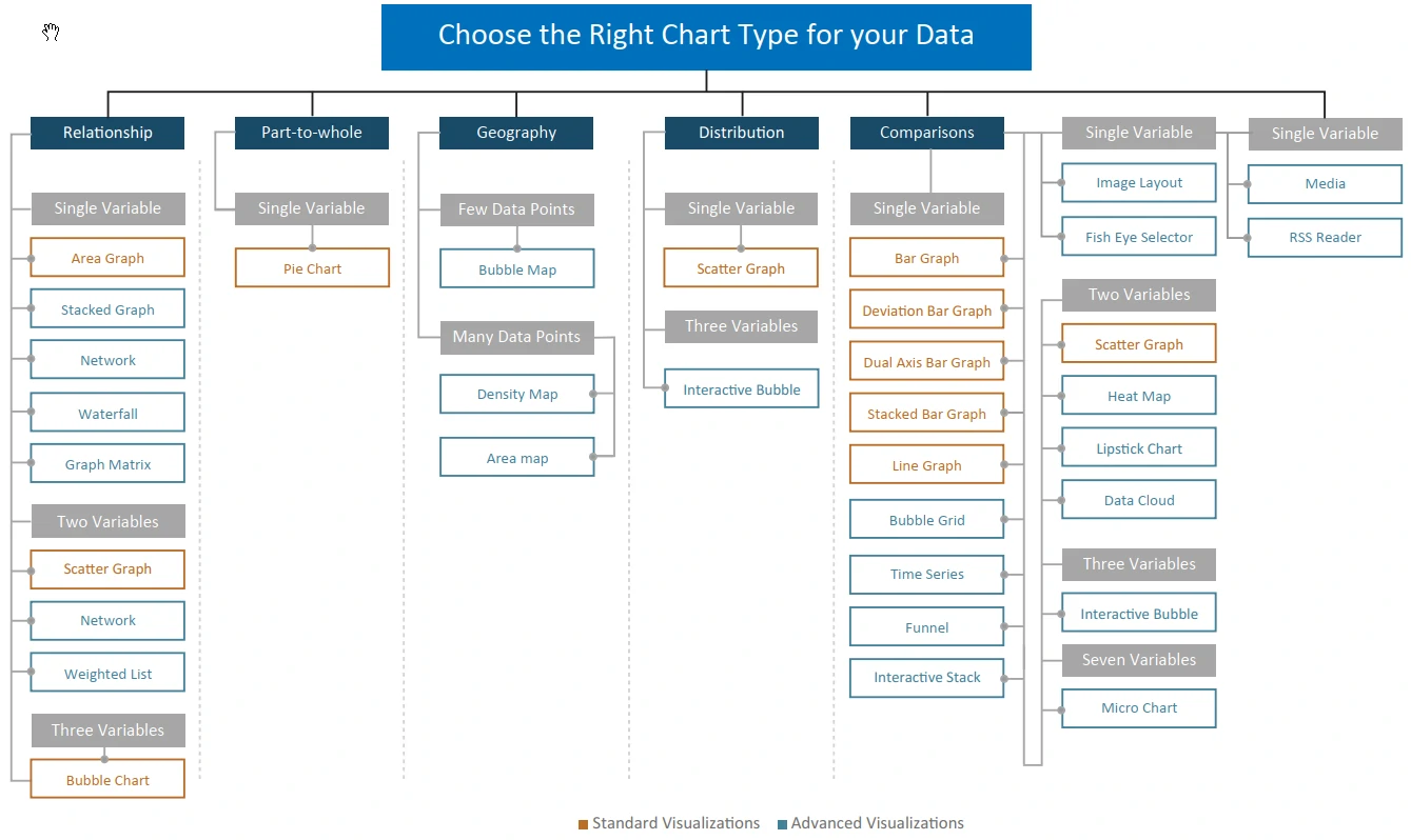
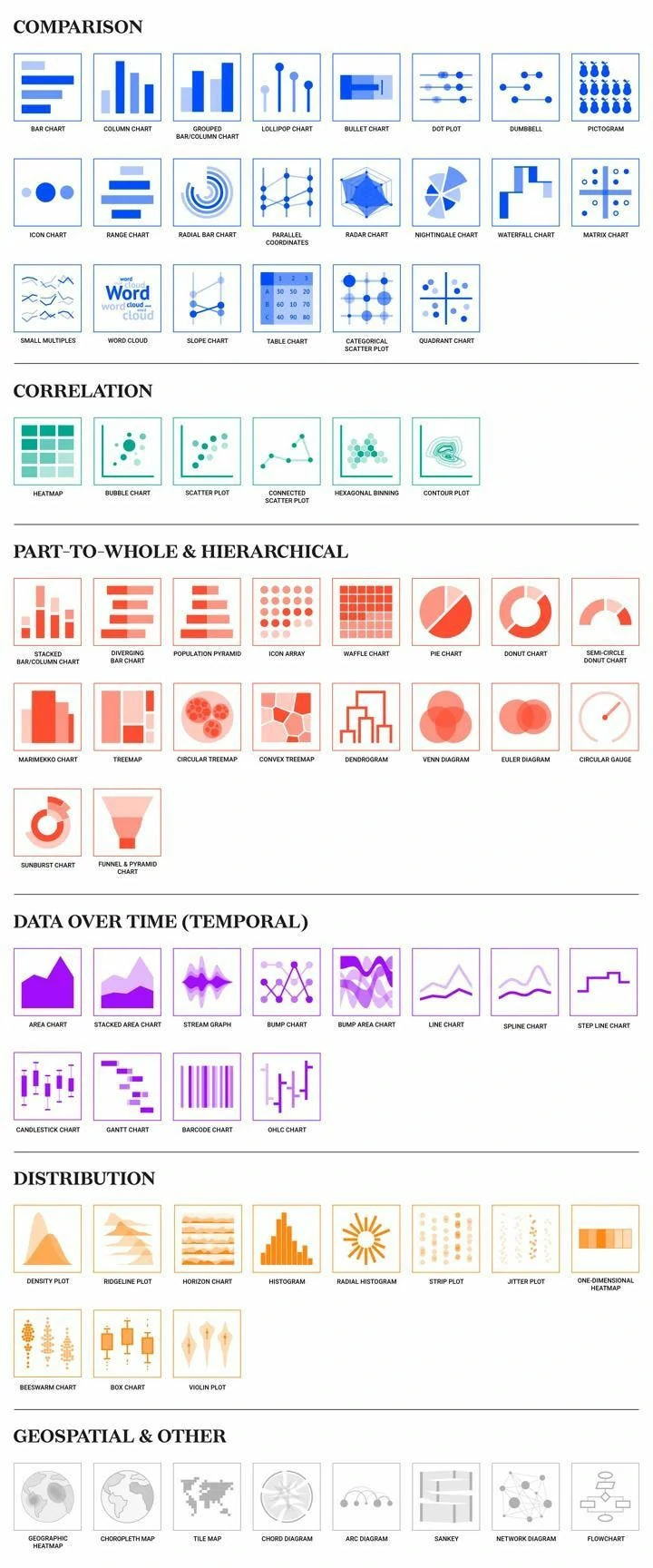
Type of Basic Visualization
Right Chart type
Indicator / Gauges
A vivid way to present changes that you’re tracking in your data. Indicators are clear, simple ways to demonstrate how your organization is doing on a particular metric, and whether you’re heading in the right direction.
Line Chart
Anything that compares data, or shows changes, over time is well suited to this type of visualization. Again, it’s all about visualizing a trend emerged over time.
You can see when peaks and troughs hit, whether the overall values are going up or down, and when there’s a sharp spike or drop in numbers. You can also compare changes over the same period of time for more than one group or category very easily, by adding a “break by” category.
Line charts often show a trend. Stretching the height of the graph can create fake drama, while stretching the width can underplay it
Notes
- MAKE USE OF POINTERS — Solid filled pointers help understand the data well. They should be used on the tip of the line.
- USE ONLY SOLID LINES — Dashed and dotted lines can be distracting
- DON’T USE A SMOOTHENED LINE — Avoid use of a smoothened line in a line graph, because it can be misleading.
Column Chart
Represents data by displaying vertical bars next to each other, lined up on the horizontal axis. Each bar represents a different category, and the height of the bar correlates with numbers on the values axis, on the left hand side.
Column charts give you an immediate way to compare values for related data sets side by side, highlighting trends in a swift, visual way. column charts are often used to show trends over time.
Bar Chart
A bar chart is essentially a column chart on its side: values are presented on the horizontal axis and the categories are on vertical axis, on the left.
From a purely practical perspective, they’re also used over column charts when the names of the categories are too long to comfortably read on their side! They are not usually used to show trends over time.
Bar charts are frequently used to compare the total number of items within a category.
Bar charts are great for comparisons. To judge their end points, the bars should begin at a zero baseline
Pie Chart
Numerical Values are translated into a percentage of 360 degrees, represented by the arc length, and each slice is colour coded accordingly.
Pie charts show what percentage of the whole is made up of each category. That means they deal with total numbers, and trends in overall responses, rather than changes over time.
it’s a good idea to use a pie chart when displaying proportional data and/or percentages.
It makes sense to use a pie chart when you want to get a rapid, overall idea of the spread of data rather than when you’re concerned about the precise figures they represent.
Pie charts seem friendly, but they’re hard to read. In most cases, you can find a better alternative.
Notes
- VISUALIZE NO MORE THAN 5 CATEGORIES PER CHART — It is difficult to differentiate between small values; depicting too many slices decreases the impact of the visualization.
- DON’T USE MULTIPLE PIE CHARTS FOR COMPARISON — Slice sizes are very difficult to compare side-by-side. Use a stacked bar chart instead.
- MAKE SURE ALL THE DATA ADDS UP TO 100% — Verify that values total 100% and that pie slices are sized in proportion to their corresponding value.
- USE STACKED BAR GRAPH INSTEAD OF PIE OR DONUT — Use of Stacked bar graph is recommended as it makes the values easy to read as compared to a pie chart.
Area Chart
An area chart is similar to a line chart but it’s more dynamic and visual, giving an idea of comparative mass. Area charts are used to demonstrate a time-series relationship. Unlike line charts, though, because they also represent volume in a highly visual way. The information is shown along two axes and each “area” is depicted using different color or shade to make it easier to interpret.
Area charts are great for showing absolute or relative (“stacked”) values – as in, showing trends as you do in a line chart, but comparing a few different trends at once. They’re particularly effective if there’s a broad disparity between some of these trends, as it makes the comparison starker, too.
Notes
- MAKE IT EASY TO READ — In stacked area charts, arrange data to position categories with highly variable data on the top and least variable at the bottom
- DON’T DISPLAY MORE THAN 4 DATA CATEGORIES — Too many categories will result in a cluttered visual that is difficult to decipher.
- AVOID GRADIENT AND TRANSPARENT COLORS — In standard area charts, ensure data isn’t obscured in the background by ordering colors thoughtfully and using transparency
- MAKE USE OF POINTERS — Solid filled pointers help in understanding the data well. It should be used on line tip between, or, on the corresponding labels.
Pivot Table
A pivot table brings together, simplifies and summarizes information stored in other tables and spreadsheets, stripping this down to the most pertinent insights. They are also used to create unweighted cross tabulations fast.
Pivot tables are one of the most simple and useful ways to visualize data. That’s because they allow you to quickly summarize and analyze large amounts of data, and to use additional features such as color formatting and data bars to enhance the visual aspects.
Pivot tables are more about simplifying tables than changing it into a graphical representation. That means they are helpful for displaying data with several subcategories in easily digestible ways.
Scatter Chart
Diagrams or plots that rely on Cartesian co-ordinates. Scatter charts are great in scenarios where you want to display both distribution and the relationship between two variables.
Params:
- X - axis
- Y - axis
- Color
- Size
- Shape
Notes
- SIZE BUBBLES APPROPRIATELY — Bubbles should be scaled according to area, not diameter.
- DON’T USE ODD SHAPES — Avoid adding too much detail or using shapes that are not entirely circular; this can lead to inaccuracies.
- START Y - AXIS VALUE AT 0 — Starting the axis above zero truncates the visualization of values.
Scatter Map / Area Map
To visualize geographical data across a region by displaying this as data points on a map
Scatter maps / area maps work a little like scatter graphs, in that the size and color of the circle illustrates quantities and types of data. However, it goes a step further by also showing where this activity is concentrated, geographically speaking.
Treemap
Is a multi-dimensional widget that displays hierarchical data in the format of clustered rectangles, which are all nested inside each other.
Data that comes under the same broad heading is grouped by color, and within each section, the size of the rectangles relate to the data volume or share.
These types of chart can be used in all kinds of different scenarios where you want to incorporate more granular insights than other visualizations will allow.
Type of Advance Visualization
Box plot
A box plot is a convenient way to visually display groups of numerical data through their quartiles. It shows distribution of data based on minimum, maximum, median, and percentiles.
Typically used in descriptive statistics, box plots are a great way to quickly examine one or more data sets graphically. they have the advantage of taking up less space, which is useful when comparing distributions between many groups or data sets.
Notes
- GROUP THE DATA SERIES — Group data series next to each other for direct comparison.
- EXPLAIN THE DATA — The function of a box plot might not be instantly understandable by all audiences. Some explanation might be required. Its use in dashboards is somewhat limited – often the box plot is used to display research data.
Gantt Chart
Gantt charts (also referred to as project timelines) are bar charts that help plan and monitor project development or resource allocation on a horizontal time scale.
They are essentially horizontal bar charts which provide graphical illustration of a schedule that can help users plan, coordinate, and track specific tasks in a project.
Notes
- DO NOT TRY TO OVERRULE DAY-TO-DAY SEMANTICS — Red usually means alert, danger or stop. Yellow stands for warning and Green indicates OK, go ahead. Hence, use these colors if you want to express the corresponding semantics.
- USE SAME COLORS FOR SIMILAR ACTIVITIES — Display grouped tasks using the same color tint for all bars of each group, and for the corresponding table area as well.
Histogram
A histogram visualizes the distribution of data over a continuous interval or a certain time period. Each bar in a histogram represents the tabulated frequency at each interval/bin. The total area of the histogram is equal to the total number of datasets.
Histograms help give an estimate of where values are concentrated, what the extremes are and whether there are any gaps or unusual values.
Pareto Chart
A Pareto chart is designed to help identify the cause of a quality problem or loss. It includes a Histogram that shows how often a specific problem is occurring or the different types of problems that are occurring.
Pareto charts allow you to display the specific areas in which improvement or investigation is necessary.
It contains both a bar and a line chart. The values are represented by descending bars and the running % to total is represented by the line. It depicts the percent journey to total & also displays actual values.
Radar Chart / Polar chart
Radar Charts are a way of comparing multiple quantitative variables.
This makes them useful for seeing which variables have similar values or if there are any outliers amongst each variable. They are also useful for seeing which variables are scoring high or low within a dataset, making them ideal for displaying performance.
Waterfall
A Waterfall visualization highlights the increments and decrements of the values of metrics over time.
Analysts can use the widget to identify aspects of their business that are contributing to the fluctuations in the values. The visualization can also be used to perform “what-if” analyses.
For e.g., % Revenue Y/Y Variance by Month. It shows how different aspects of the business positively or negatively affect the bottom line.
Time series
A Time Series Slider is an area graph that allows a document analyst to choose which section of the graph to view at a time.
It allows users to see a high level trend of one or more metrics and a detailed view by varying the window of the visible data.
Bubble Grid
The Bubble Grid conveys information that helps an analyst identify important trends or anomalies in data, relative to the total contribution of accompanying data.
Metric values are plotted as bubbles of different colors and sizes; the colors and sizes of the bubbles represent the values of two distinct metrics on the Grid/Graph that contains the widget. Each bubble is generated at the intersection of two different attribute elements.
The Bubble Grid is most beneficial when used to perform analyses involving key business ratios, such as the number of customers in a store vs. the revenue generated per customer.
Funnel
A Funnel helps to quickly analyze various trends across several metric values.
It is a variation of a stacked percent bar chart that displays data that adds up to 100%.
It can also show the stages process and reveal the amount for each stage.
Lipstick Chart
The Lipstick chart provides different methods of viewing data. For each x-axis value, the gray bar illustrates the actual recorded value. The expected value is represented by the red and green bars.
When the expected value exceeds the actual value, a red bar is placed on top of the actual value bar, extending above the grey bar for the value difference between expected and actual values. If the actual value exceeds the expected value, the green bar is displayed on top of the actual value bar, marking the difference between the expected and actual values.
Micro Chart
Micro chart visualizations gives the trend of a metric at a glance without having to know many additional details. The bar, sparkline, and bullet microcharts used in the microcharts convey information that an analyst can understand just by looking at the chart once.
Network Visualization
The Network Visualization allows you to quickly and easily identify relationships between related items and clusters. visualizing a social network or when displaying a market basket analysis.
Data Cloud
A Data Cloud displays attribute elements in various sizes to depict the differences in metric values between the elements. allow an analyst to quickly identify the most significant, positive, or negative contributions.
A Data Cloud widget is basically a list of attribute elements. The first metric on the template determines the font size for the attribute elements. A bigger font for an element indicates a larger metric value.
Sunburst Widget
The sunburst widget is similar to a pie chart, but is extraordinarily multidimensional.
The sunburst widget can display multiple rings, one for each field where each ring shows a breakdown of its parent ring slice.
Calendar Heat-map
The calendar heatmap is used to visualize values over days in a calendar-like view, making it easy to identify daily patterns or anomalies.
TIPS and TRICKS
- Geckoboard
- Start from nothing — Bar charts are great for comparisons. To judge their end points, the bars should begin at a zero baseline.
- Distorted reality — Line charts often show a trend. Stretching the height of the graph can create fake drama, while stretching the width can underplay it
- Ditch the pie — Pie charts seem friendly, but they’re hard to read. In most cases, you can find a better alternative.
- Size matters — It’s harder to compare areas or volumes than lengths. To avoid people getting the wrong impression, use them as a last resort.
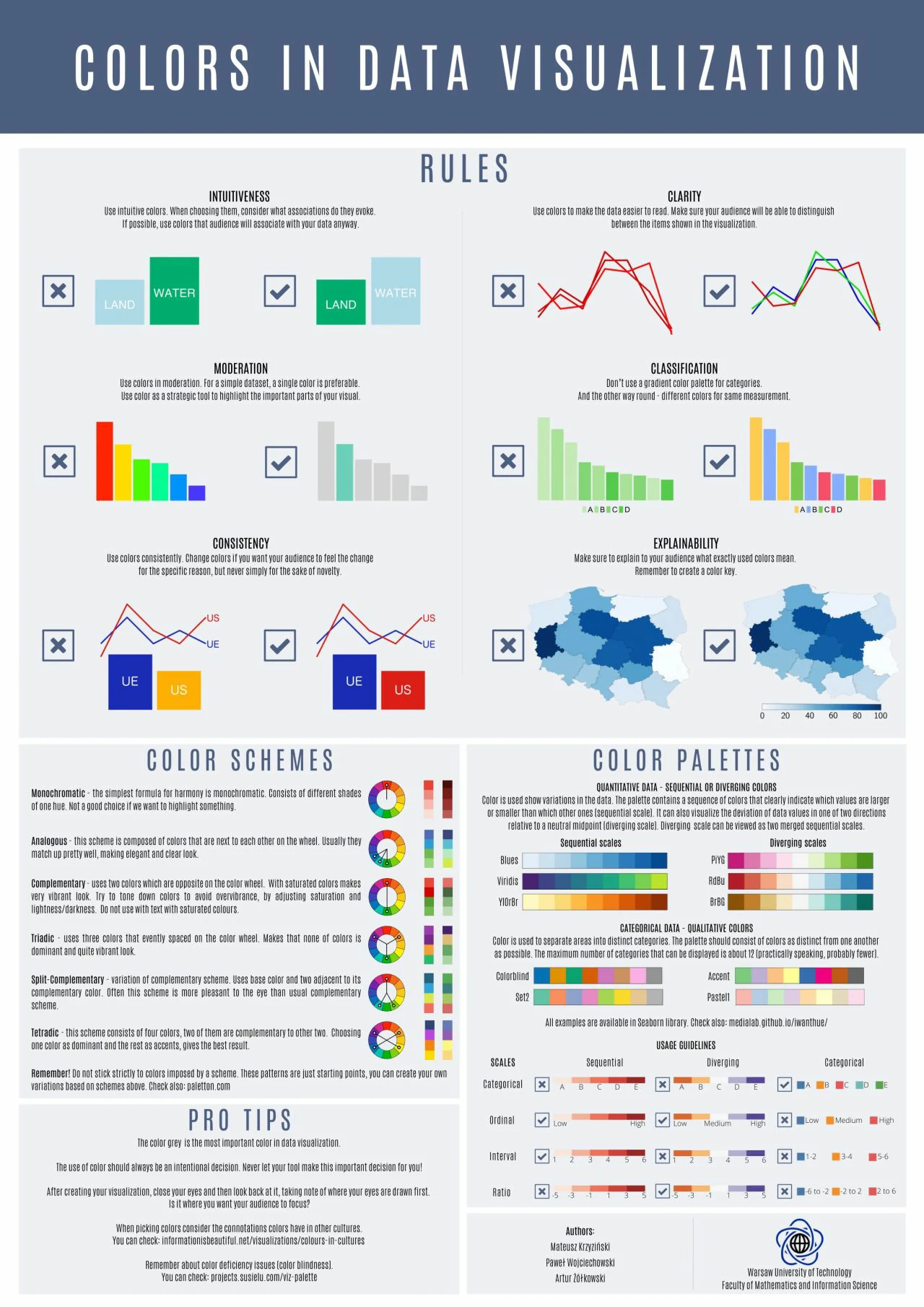
- Over the rainbow — Use color to communicate information and not for decoration. Too many colors can confuse and disorient.
- Spare the ink — Background, borders, shading, dark grid lines and needless labels are your enemies. Banish them to draw attention to the data.
- A dimension too far — Unless you’re plotting the third dimension, don’t use 3D. It skews the data and makes comparisons harder.
- Stick to the point — Extra decimal places look impressive and imply accuracy, but they’re often pointless. So, take a step back and round numbers off before plotting.
- Avoid mysteries — Text is your friend. Thoughtful use of labels means no one’s in the dark. Every chart and every axis need at least a title.
- A tale of two stories — Charting two sets of data with one scale on the left and another on the right can be confusing and suggests a relationship that may not exist.
- Stand on the right — Tables are good for looking up individual numbers. But, to help people scan and compare them, align whole numbers flush right.
- Back to basics — With charts, simpler is always better. To keep things even clearer, when you have one or two values, just show the numbers.
- Graphs makeover
- Box plots are great to compare distributions, but they are not intuitive, so I added an explanation and highlighted the zone above the target limit (threshold).
- Focus the attention on the insights. for more than 3 categories and focus on trend, stack bar is not good. set all baseline at same level.
- Don’t to much information, grid lines, difficult to focus attention. make clean and clear, used color to highlight.
- color used to highlight the trend and focus part.
- Eliminated axis, lines and pivoted the information to see each target individually and easily comparable with the others. The colors help to understand the trend.
- Differentiating the forecast from actual data and highlighting trends
- Infocepts
- EXCEEDING BOUNDARIES OF THE DASHBOARD — Critical information may be overlooked if the user has to scroll to access data. All information should be visible at once.
- INFORMATION HIERARCHY — Summary information should be at the top left corner of the dashboard. Organize related information in groups. Highlight the most important information.
- HIGHLIGHT IMPORTANT INFORMATION EFFECTIVELY — Not everything that deserves space on a dashboard is equally important. The viewer’s eye should always be directed to the most crucial information first. Users should immediately be drawn to your key piece of information.
- AVOID DISPLAYING EXCESSIVE DETAILS — Dashboards include high-level information for a quick overview. Too much detail, expressed too precisely, slows the pace of viewers. (Use $3.8 M instead of $3848305)
- MAKE APPROPRIATE USE OF VISUALIZATION — Use the right representation for information. Do not overuse the visualization.
- AVOID OVERSIZING OF VISUALIZATION — Do not oversize the visualization on the screen to cover real estate. Stretching the visuals to cover white space is not a good idea.
- AVOID ALL NON DATA INK ELEMENTS — Avoid dark background colors for grids and graphs. Don’t use bright fluorescent colors in graphs; Don’t use borders for legends. Use grid lines only when necessary.
- FONT SELECTION — Using too many font types makes the text hard to read & the font appears squished.
- USE OF GRIDS — Headers should be distinctive from the body, delete non-data ink (bg color, grid lines); attribute headers and values should be left aligned; metric headers and values should be right aligned; total should be clearly visible.
- USE OF COLORS — Red and green colors should be used to represent values: Green represents positive and red represents a negative value. Avoid use of threshold colors on graphs.
- THE COLOR SHOULD REPRESENT THE INFORMATION — Don’t guide your users attention to the less important things by using bold colors for them.
Types of Analytical Applications
STRATEGIC
- Target Users - Decision makers & Senior Management.
- Analysis type - High level measures of performance, Snapshots of daily, weekly & monthly data.
- Key Design Considerations
- Displays a high level overview of the business state
- Focuses on high-level performance measures and Key KPIs
- More focus on actual goals instead of target
- Typically displays static snapshots of daily, weekly, or monthly data
- Provides limited user interaction
- Showcases opportunities available to the business
- Best Practices
- Avoid including too many details
- Avoid use of advance visualizations
- Highlight outliers effectively
- Use thresholds, highlight positive and negative values
- Focus on actionable insights rather than making the dashboard attractive
ANALYTICAL
- Target Users - Mid management & Planning team.
- Analysis type - Complex data with rich comparison. Interactive display and historical data.
- Key Design Considerations
- More complex data with rich comparisons
- More focus on historic data
- Interactive display with high user interaction
- Typically displays historic data with YOY (Year on Year) comparison
- Showcases an in depth analysis of data
- Includes drill down functionalities
- Offers the flexibility to filter data from multiple parameters
- Includes data discovery capabilities
- Best Practices
- Includes data discovery capabilities
- Highlight insights properly
- Focus on actionable insights rather than making the dashboard attractive
OPERATIONAL
- Target Users - Operational workers.
- Analysis type - Monitoring activities that are constantly changing. Shows real time or near real time data.
- Key Design Considerations
- Focuses on high level measures of performance and Key KPIs
- More focus on real or near real time data
- Quick & static snapshot
- Typically display static snapshots of daily data
- Displays high -level overview of the state of the business
- Showcases up and down in daily business
- More focus on outliers
- Best Practices
- Avoid putting too many details
- Keep visualizations simple but actionable
- Make good use of per-attentive attributes
- Use thresholds and highlight positive & negative values
- Focus on actionable insights rather than making the dashboard attractive