TIPS and TRICKS
Visualization
Foundation
Geckoboard
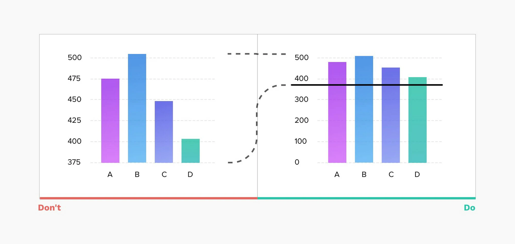
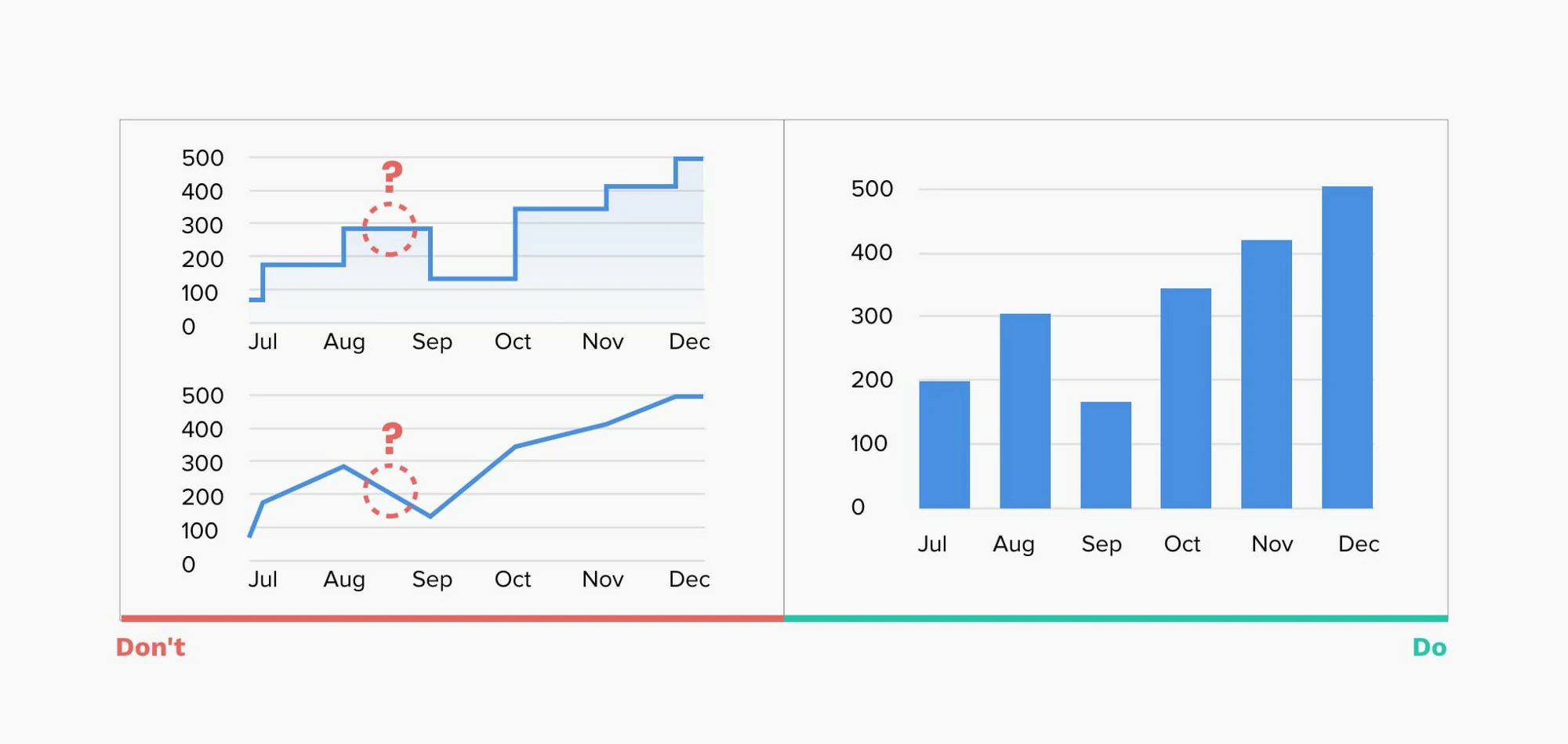
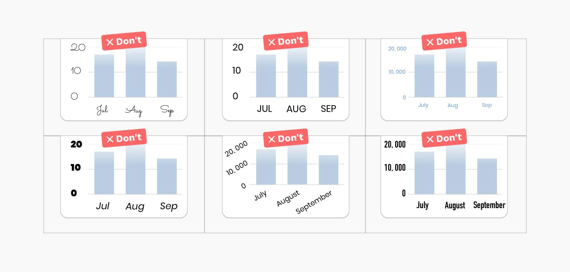
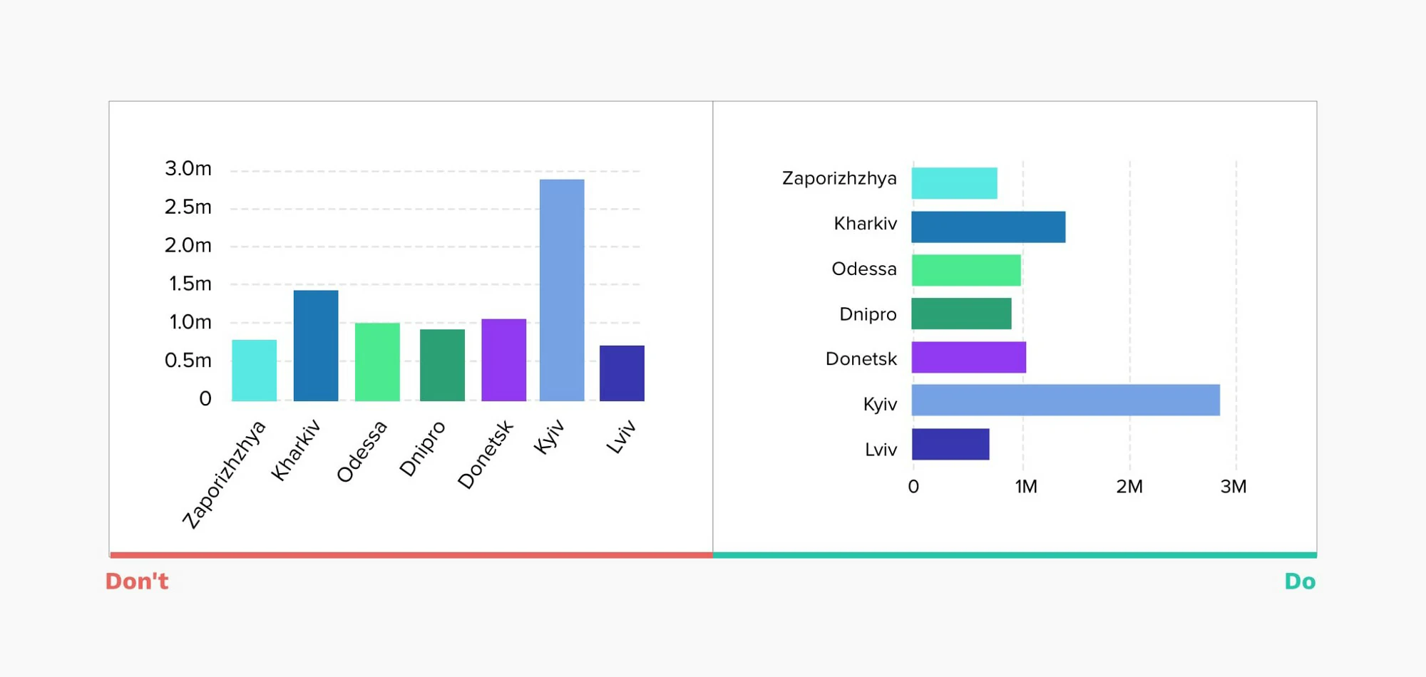
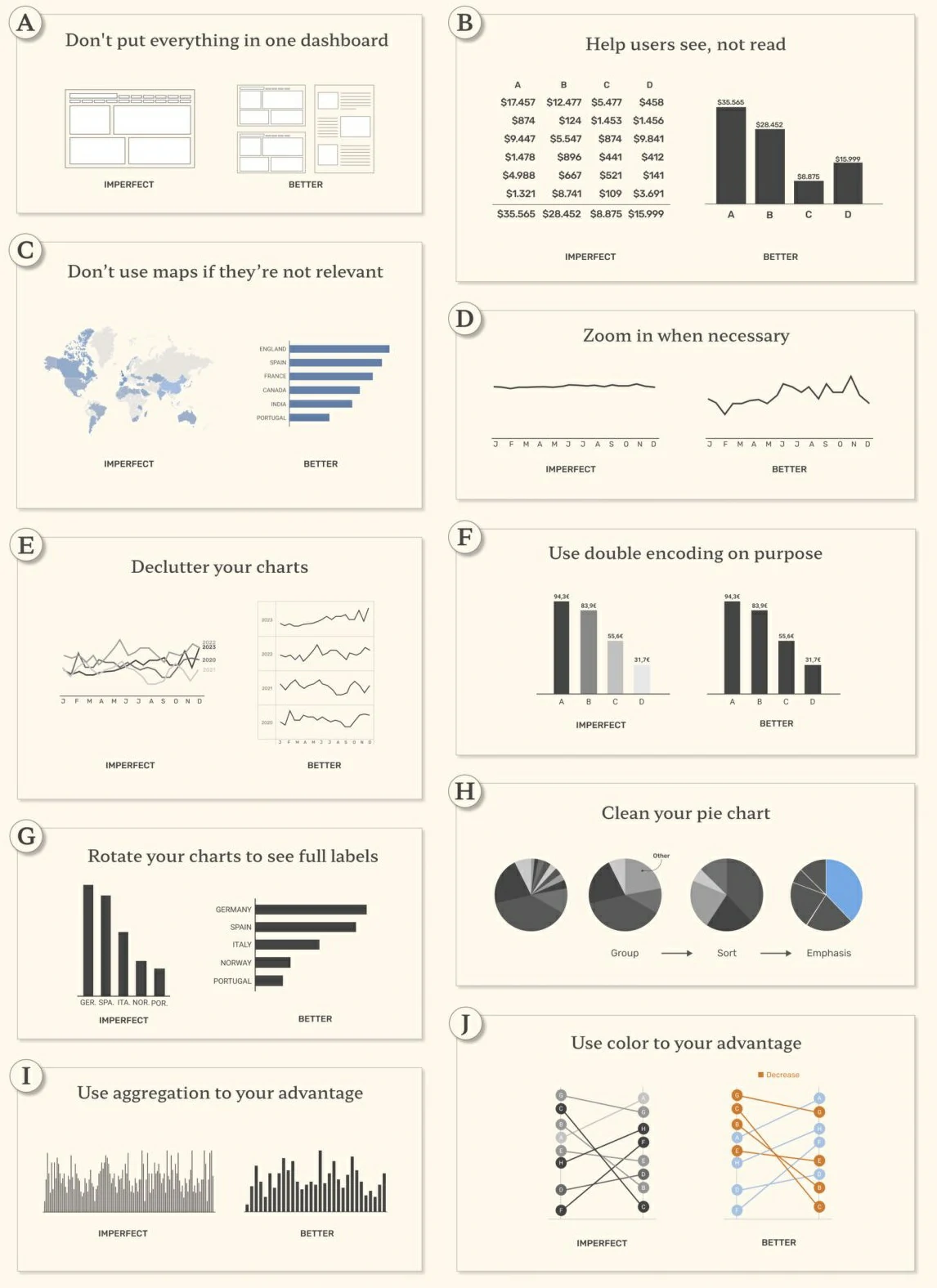
- Start from nothing — Bar charts are great for comparisons. To judge their end points, the bars should begin at a zero baseline.
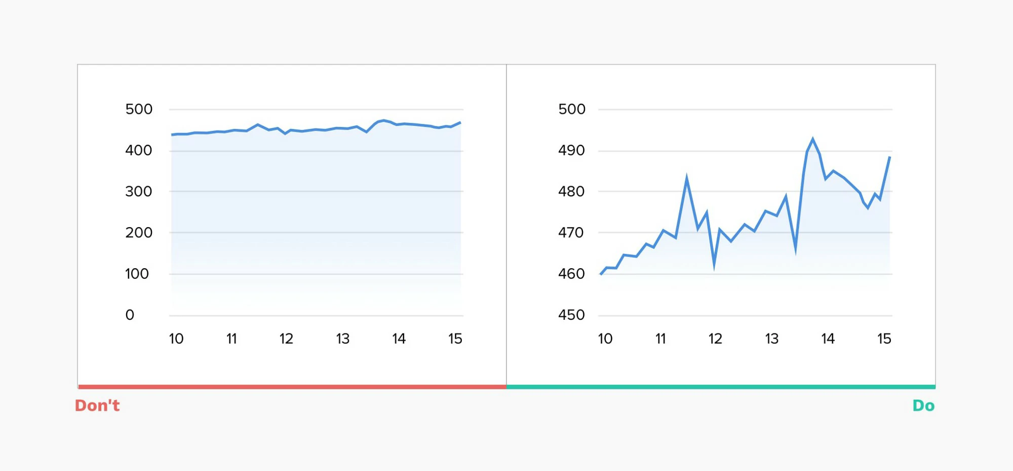
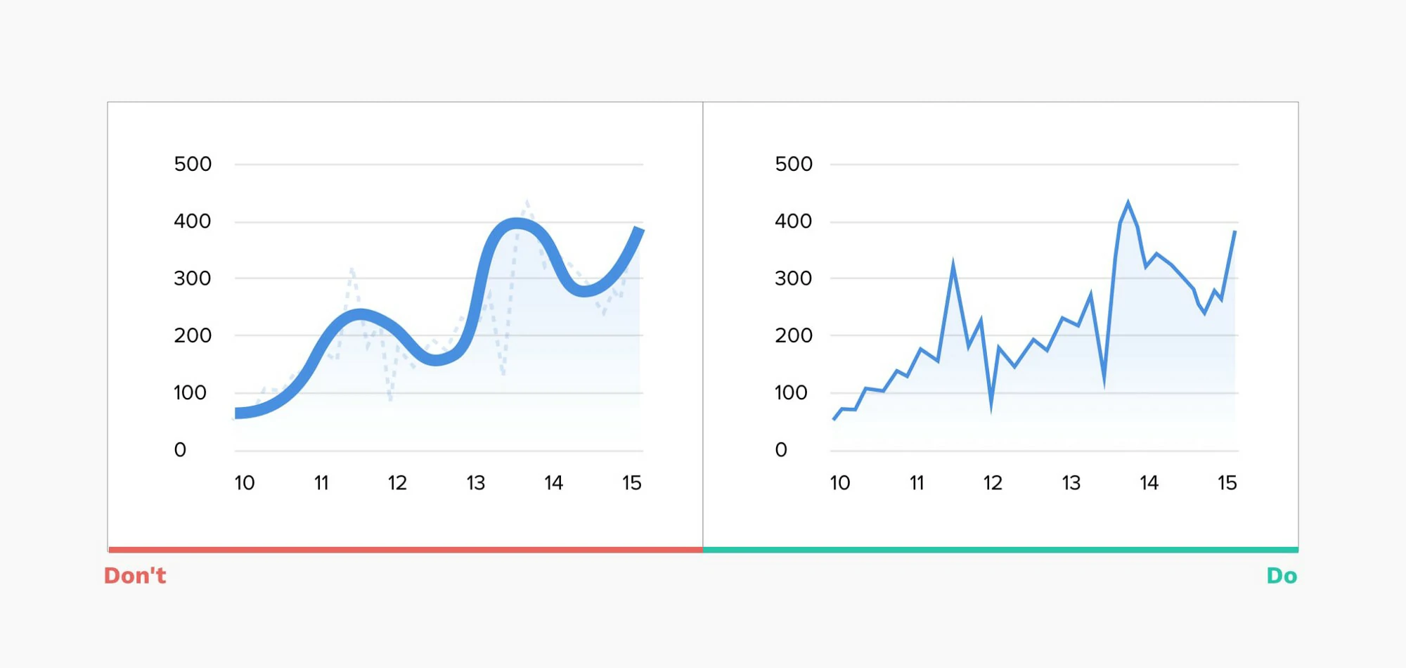
- Distorted reality — Line charts often show a trend. Stretching the height of the graph can create fake drama, while stretching the width can underplay it
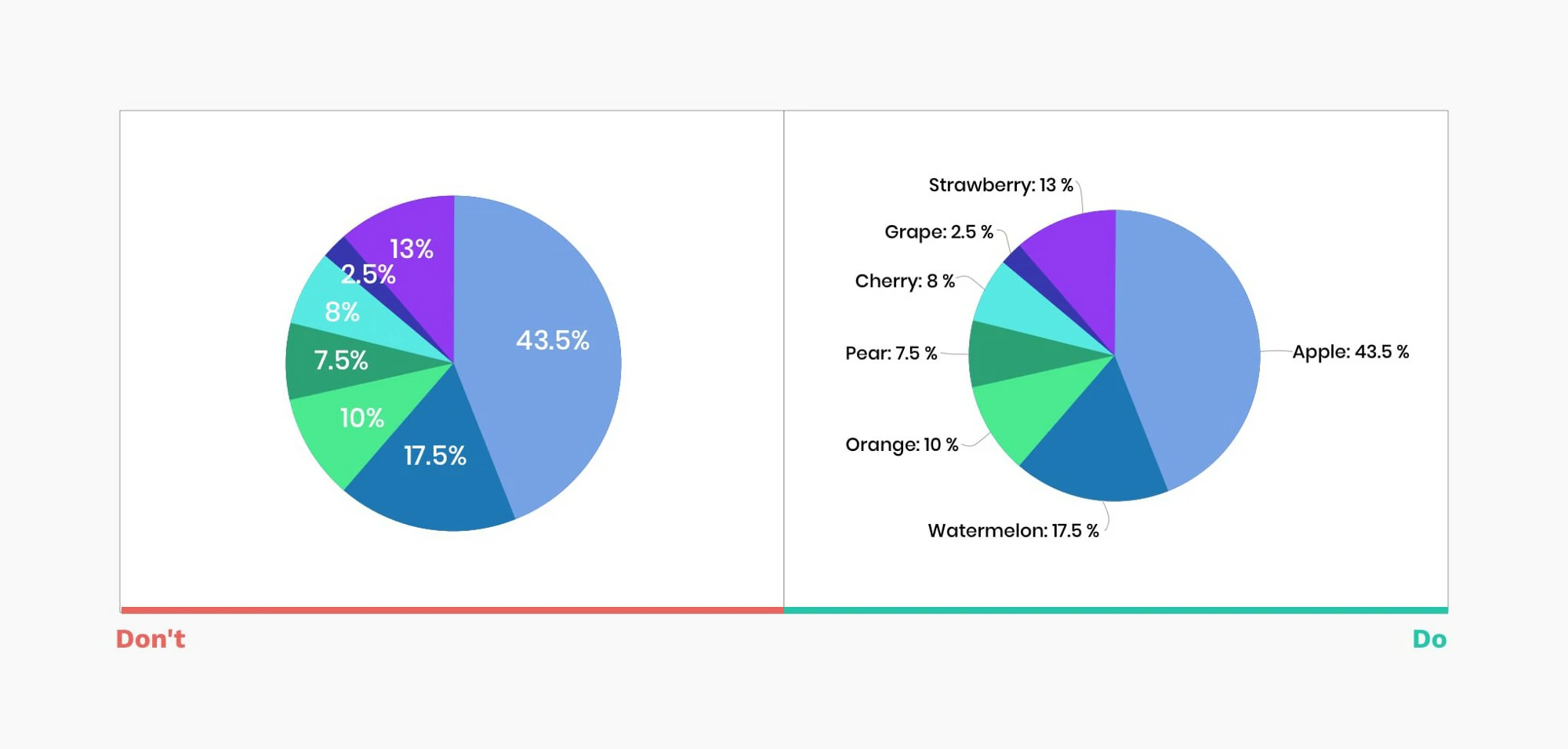
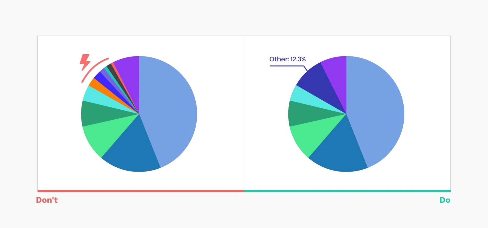
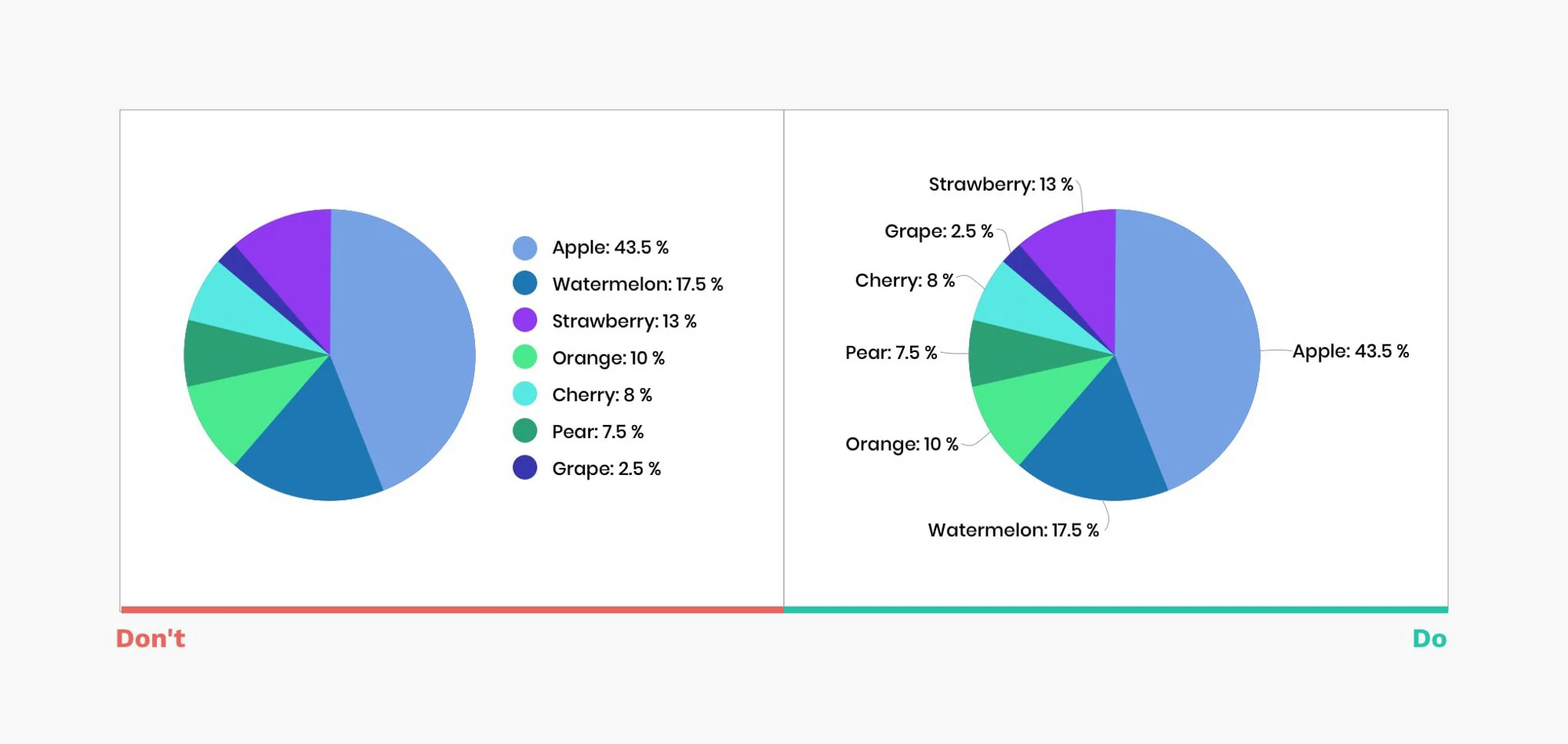
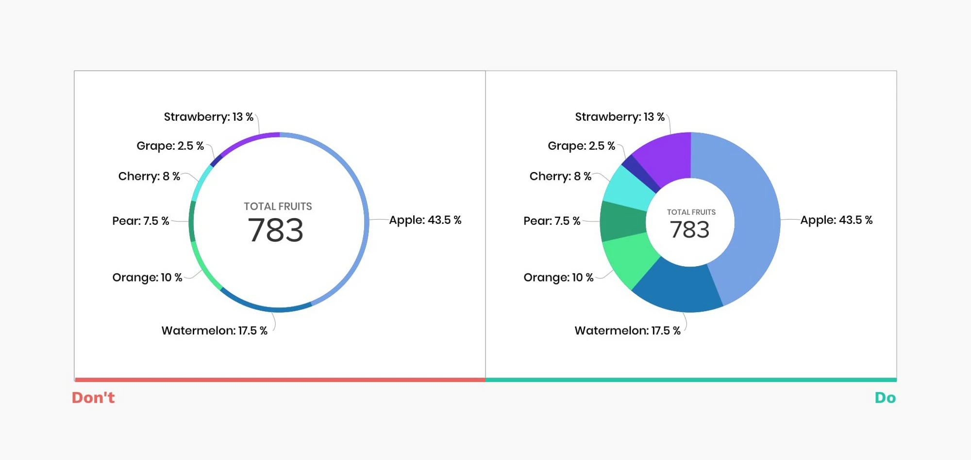
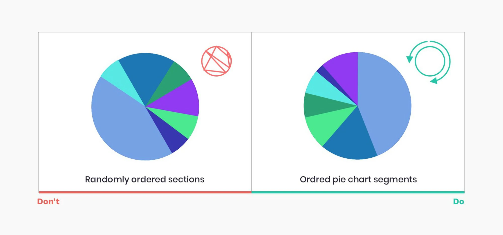
- Ditch the pie — Pie charts seem friendly, but they’re hard to read. In most cases, you can find a better alternative.
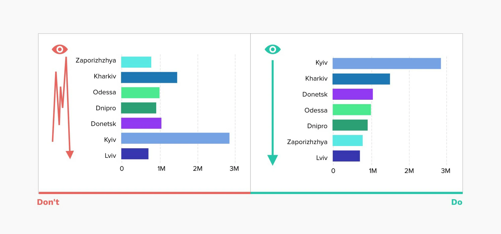
- Size matters — It’s harder to compare areas or volumes than lengths. To avoid people getting the wrong impression, use them as a last resort.
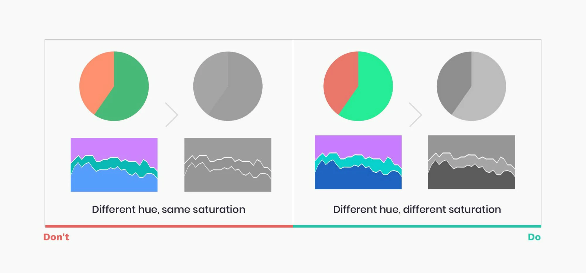
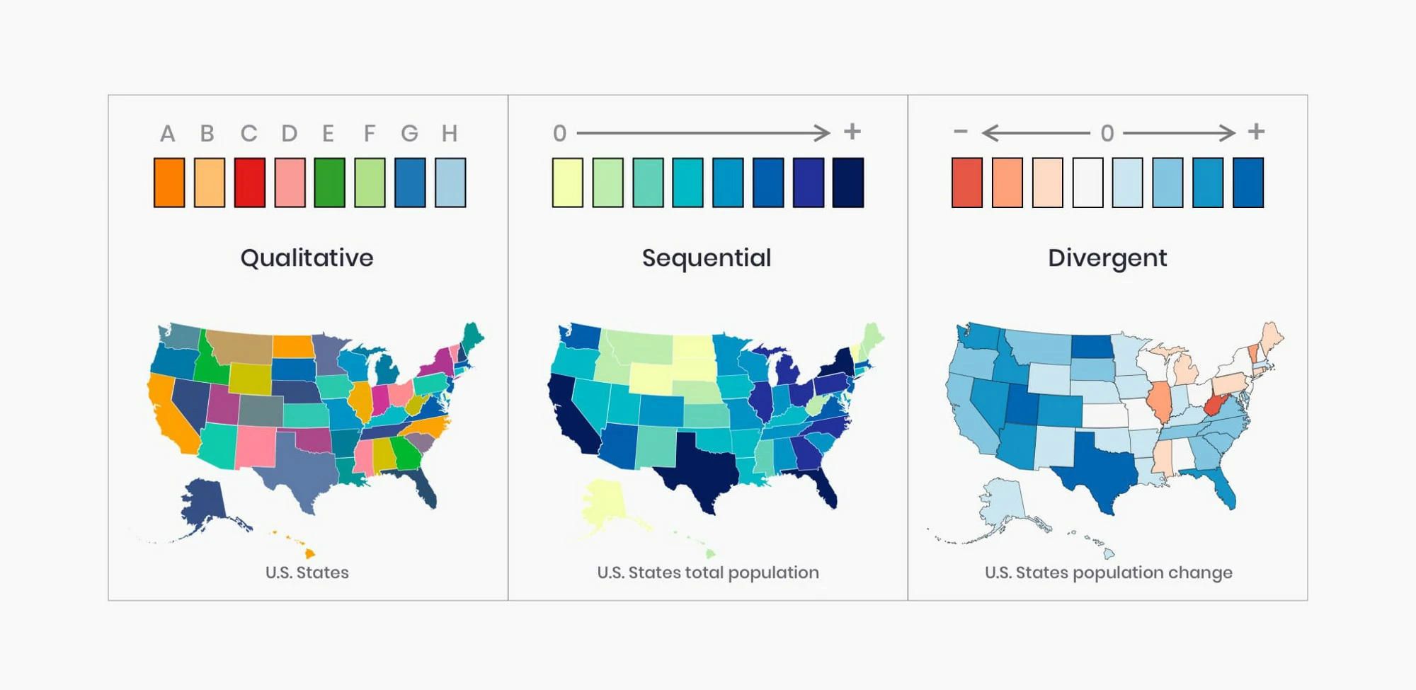
- Over the rainbow — Use color to communicate information and not for decoration. Too many colors can confuse and disorient.
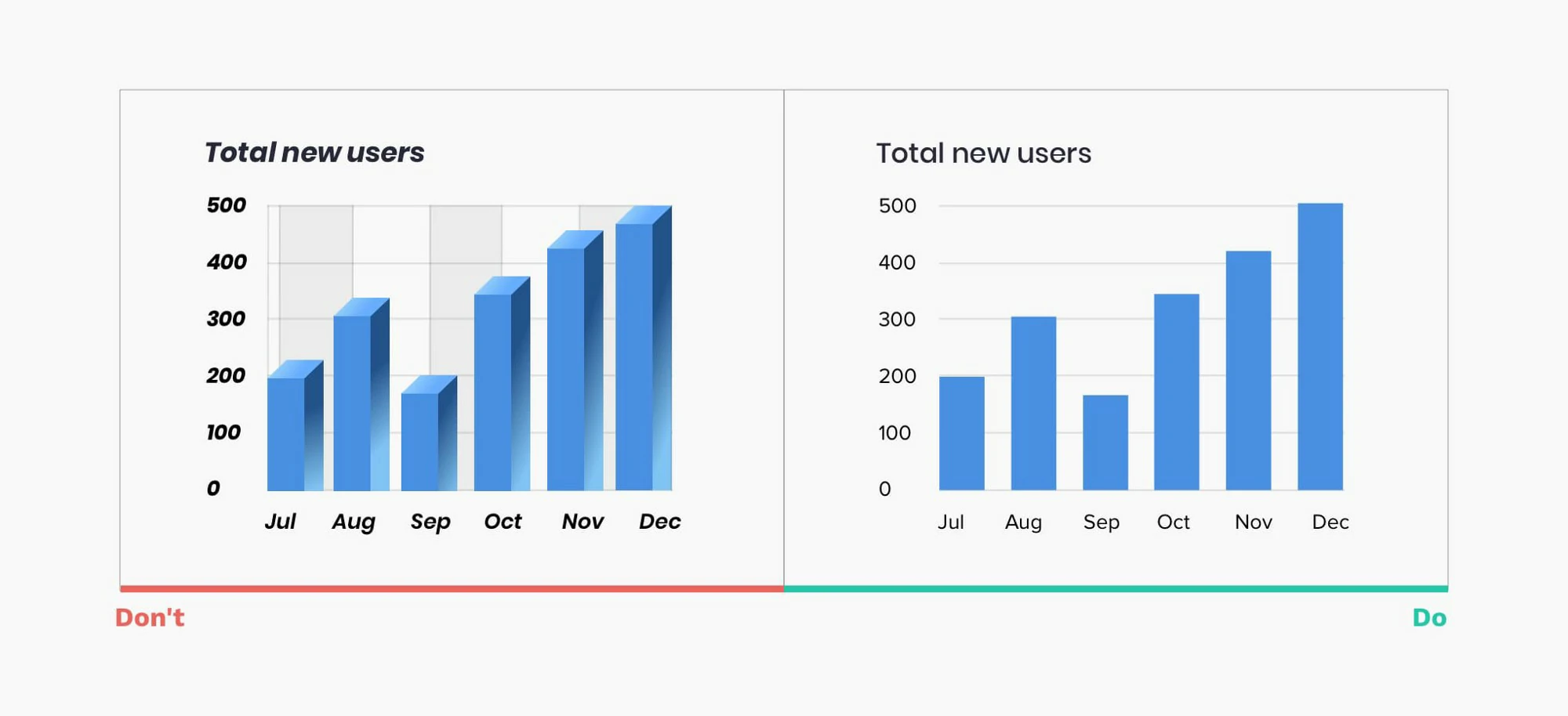
- Spare the ink — Background, borders, shading, dark grid lines and needless labels are your enemies. Banish them to draw attention to the data.
- A dimension too far — Unless you’re plotting the third dimension, don’t use 3D. It skews the data and makes comparisons harder.
- Stick to the point — Extra decimal places look impressive and imply accuracy, but they’re often pointless. So, take a step back and round numbers off before plotting.
- Avoid mysteries — Text is your friend. Thoughtful use of labels means no one’s in the dark. Every chart and every axis need at least a title.
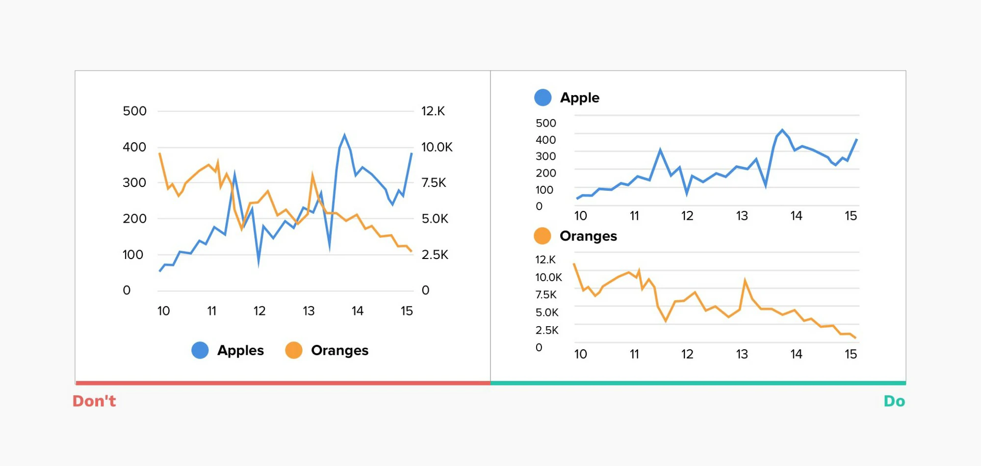
- A tale of two stories — Charting two sets of data with one scale on the left and another on the right can be confusing and suggests a relationship that may not exist.
- Stand on the right — Tables are good for looking up individual numbers. But, to help people scan and compare them, align whole numbers flush right.
- Back to basics — With charts, simpler is always better. To keep things even clearer, when you have one or two values, just show the numbers.
Graphs makeover
- Box plots are great to compare distributions, but they are not intuitive, so I added an explanation and highlighted the zone above the target limit (threshold).
- Focus the attention on the insights. for more than 3 categories and focus on trend, stack bar is not good. set all baseline at same level.
- Don’t to much information, grid lines, difficult to focus attention. make clean and clear, used color to highlight.
- color used to highlight the trend and focus part.
- Eliminated axis, lines and pivoted the information to see each target individually and easily comparable with the others. The colors help to understand the trend.
- Differentiating the forecast from actual data and highlighting trends
Infocepts
- EXCEEDING BOUNDARIES OF THE DASHBOARD — Critical information may be overlooked if the user has to scroll to access data. All information should be visible at once.
- INFORMATION HIERARCHY — Summary information should be at the top left corner of the dashboard. Organize related information in groups. Highlight the most important information.
- HIGHLIGHT IMPORTANT INFORMATION EFFECTIVELY — Not everything that deserves space on a dashboard is equally important. The viewer’s eye should always be directed to the most crucial information first. Users should immediately be drawn to your key piece of information.
- AVOID DISPLAYING EXCESSIVE DETAILS — Dashboards include high-level information for a quick overview. Too much detail, expressed too precisely, slows the pace of viewers. (Use $3.8 M instead of $3848305)
- MAKE APPROPRIATE USE OF VISUALIZATION — Use the right representation for information. Do not overuse the visualization.
- AVOID OVERSIZING OF VISUALIZATION — Do not oversize the visualization on the screen to cover real estate. Stretching the visuals to cover white space is not a good idea.
- AVOID ALL NON DATA INK ELEMENTS — Avoid dark background colors for grids and graphs. Don’t use bright fluorescent colors in graphs; Don’t use borders for legends. Use grid lines only when necessary.
- FONT SELECTION — Using too many font types makes the text hard to read & the font appears squished.
- USE OF GRIDS — Headers should be distinctive from the body, delete non-data ink (bg color, grid lines); attribute headers and values should be left aligned; metric headers and values should be right aligned; total should be clearly visible.
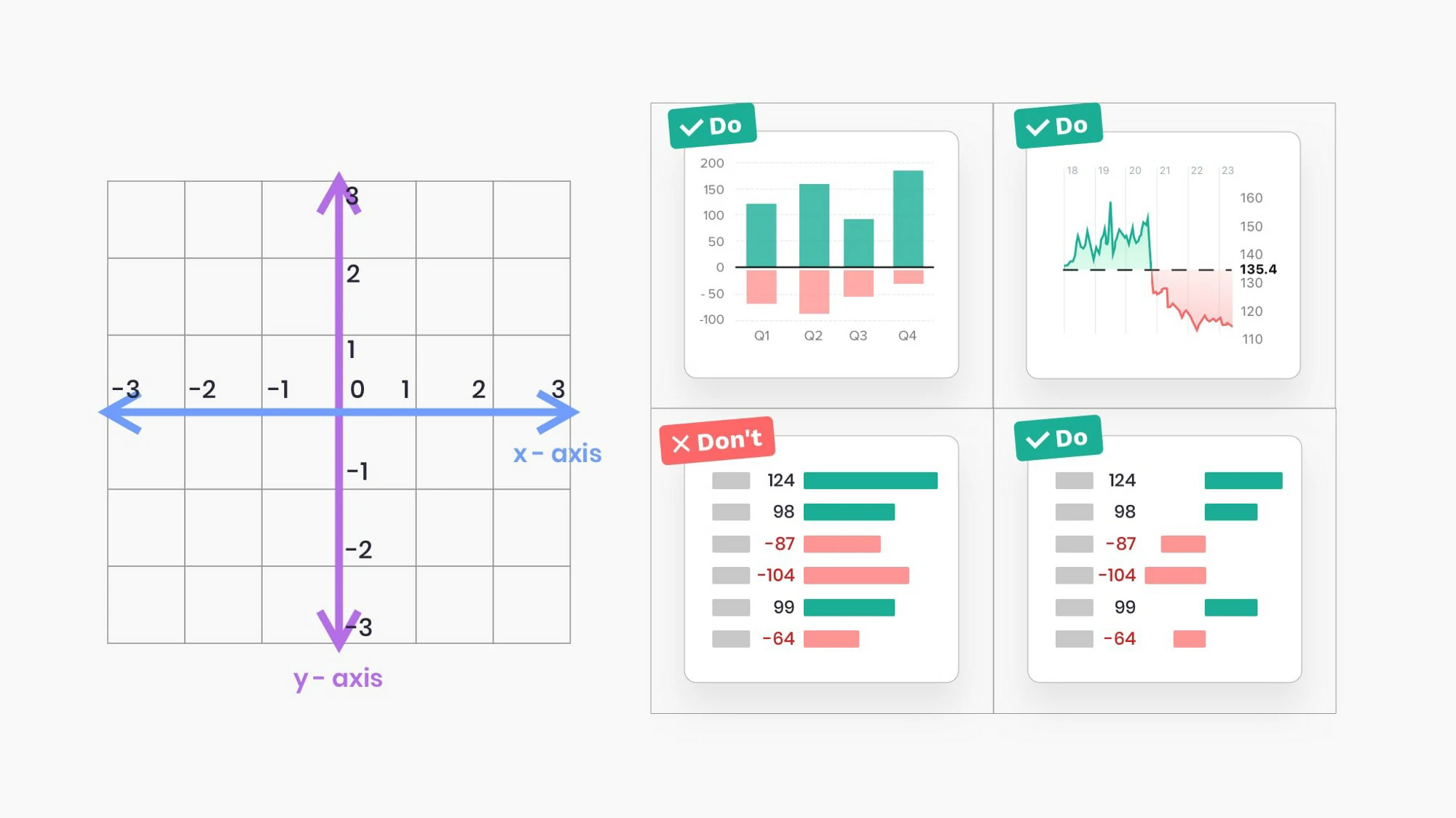
- USE OF COLORS — Red and green colors should be used to represent values: Green represents positive and red represents a negative value. Avoid use of threshold colors on graphs.
- THE COLOR SHOULD REPRESENT THE INFORMATION — Don’t guide your users attention to the less important things by using bold colors for them.